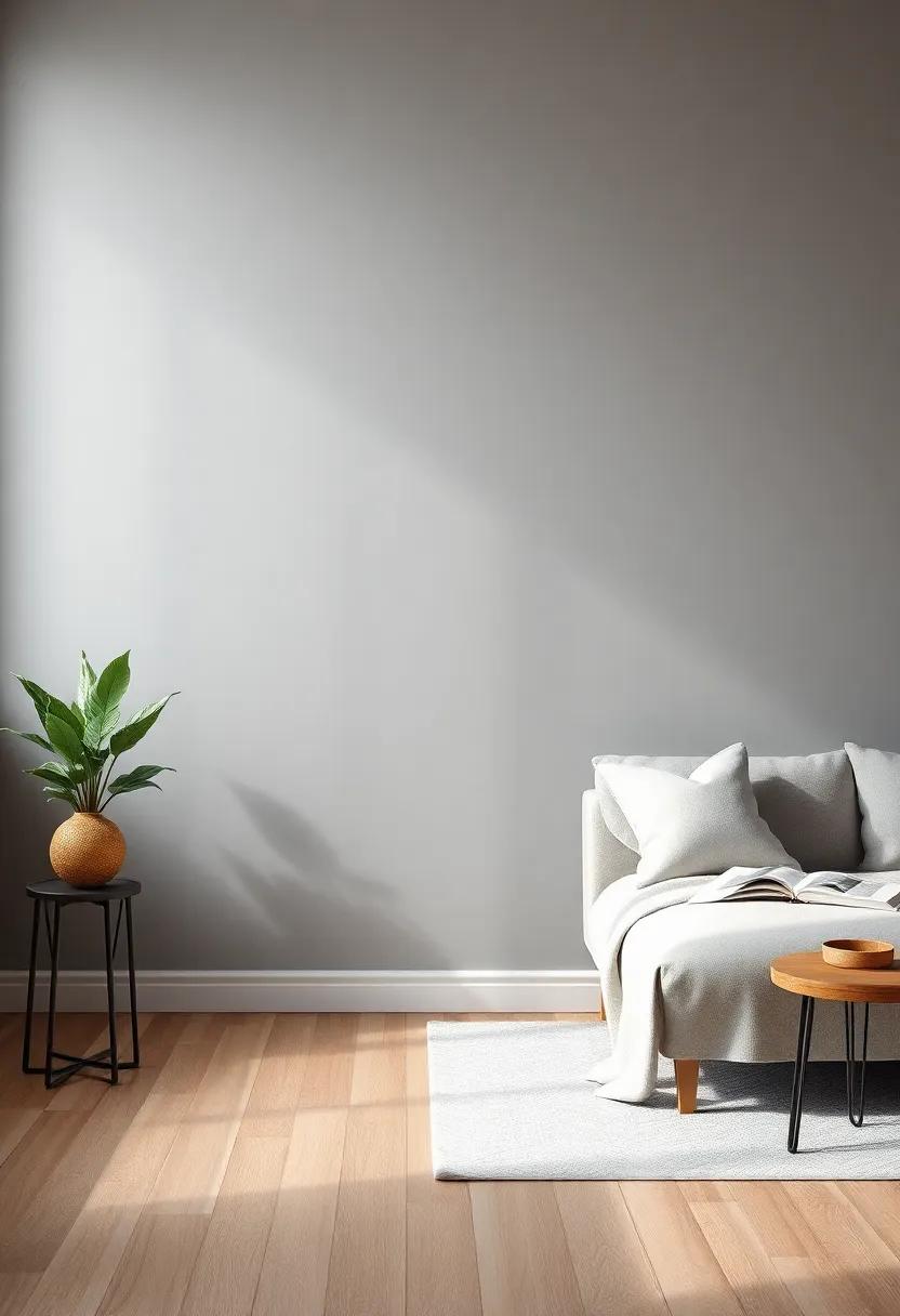
 Decorationg Interior Design

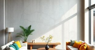
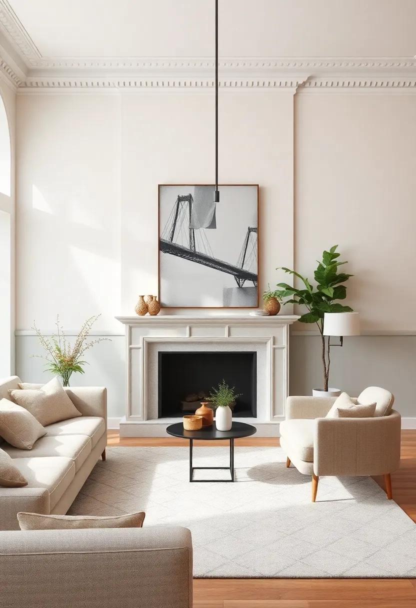
In the world of interior design, the color of your walls sets the stage for your entire living space. While bold hues can certainly make a statement,there’s something inherently sophisticated about muted tones. If you’re looking to create a tranquil atmosphere that exudes elegance and timeless charm,you’re in the right place. In this listicle,we’ve curated 29 muted living room wall colors that will help you achieve that coveted refined aesthetic. From soft neutrals to delicate pastels, these shades are perfect for enhancing your space without overpowering it. As you explore our carefully chosen selections, you’ll not only gain inspiration for your own home but also insights into how each color can harmonize with furnishings, lighting, and decor. Prepare to transform your living room into a sanctuary of style and serenity!
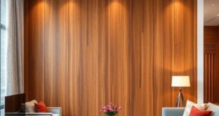
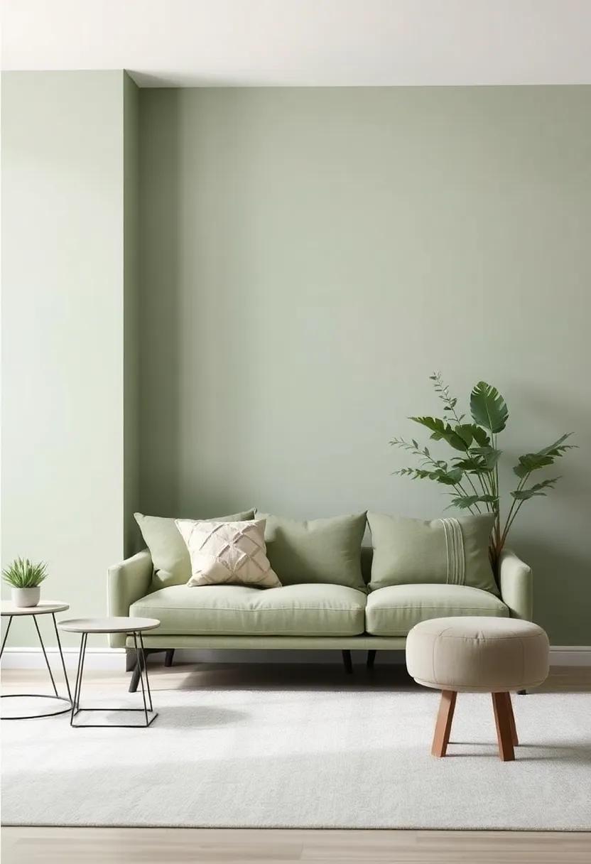
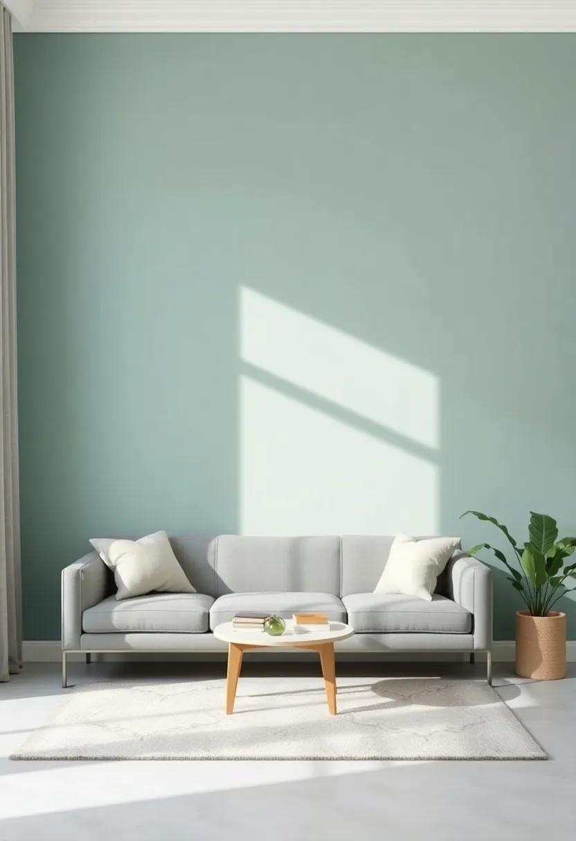
Soft Sage Green: A gentle hue that evokes tranquility while adding a touch of nature to your living space
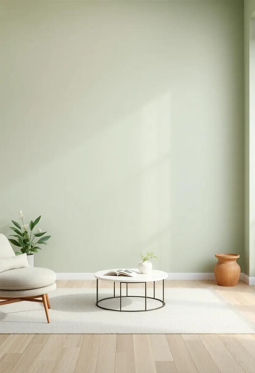
Soft sage green serves as a delicate backdrop for those seeking a harmonious blend of nature and indoor comfort. This muted hue brings a sense of ease and serenity to your living space, allowing for a refreshing ambiance that’s conducive to relaxation and mindfulness. By choosing shades of sage,you invite the tranquility of the outdoors inside,creating an atmosphere that feels both rejuvenating and inviting.
When incorporating this soothing color, consider pairing it with light wood tones, off-white accents, or muted beige furnishings to accentuate the peaceful vibe. Here are some design elements that enhance the essence of sage green:
- Natural Textures: Incorporate wicker, rattan, or linen for added warmth.
- Live Plants: Use greenery to create a striking contrast that complements the hue.
- Soft Lighting: Opt for warm white bulbs to amplify the tranquil atmosphere.
To visualize the perfect balance in your living room, here’s a simple comparison of complementary colors:
| Sage Green Pairing | Effect |
|---|---|
| Soft Neutrals | Creates a calm and cohesive look. |
| Dusty Rose | Adds a subtle romantic touch. |
| Warm Grays | Introduces sophistication without overpowering. |
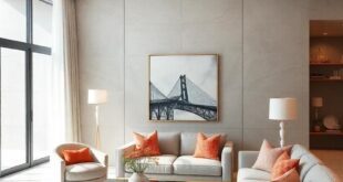
Dusty Rose: This elegant pink brings warmth and sophistication, perfect for creating a cozy atmosphere
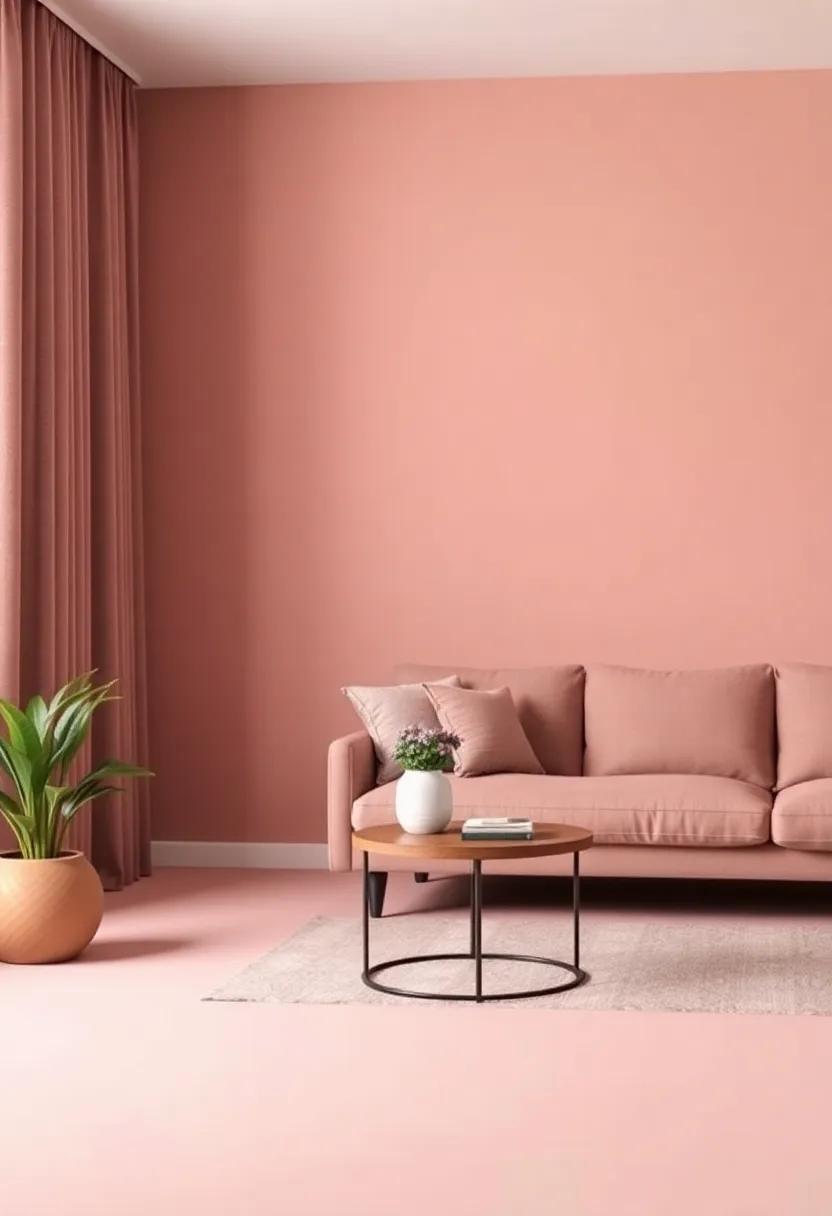
Embracing the gentle allure of this soft pink hue can transform any living room into a serene haven, blending warmth and sophistication effortlessly. Its muted tone radiates a sense of comfort, making family gatherings cozier and quiet evenings more inviting. When paired with the right furnishings, this color presents an exquisite backdrop that enhances your interior decor while ensuring the space never feels overwhelming. Consider incorporating natural elements, such as wooden accents or lush greenery, to balance the softness of dusty rose, creating a harmonious and inviting surroundings.
To further amplify the elegance of this shade, think about the interplay of complementary colors. Subtle neutrals, like creamy whites and soft grays, can pair beautifully with dusty rose, allowing it to shine without competing for attention. To provide a pop of contrast, introduce accents in darker tones like deep navy or charcoal, crafting a sophisticated visual narrative.Here are some of the best combinations and decor tips:
| Accent Color | Suggested Decor Elements |
|---|---|
| Charcoal Gray | Throw pillows, rugs, and curtains |
| Creamy White | Furniture, trim, and wall frames |
| Deep Navy | Artwork, side tables, and decorative vases |
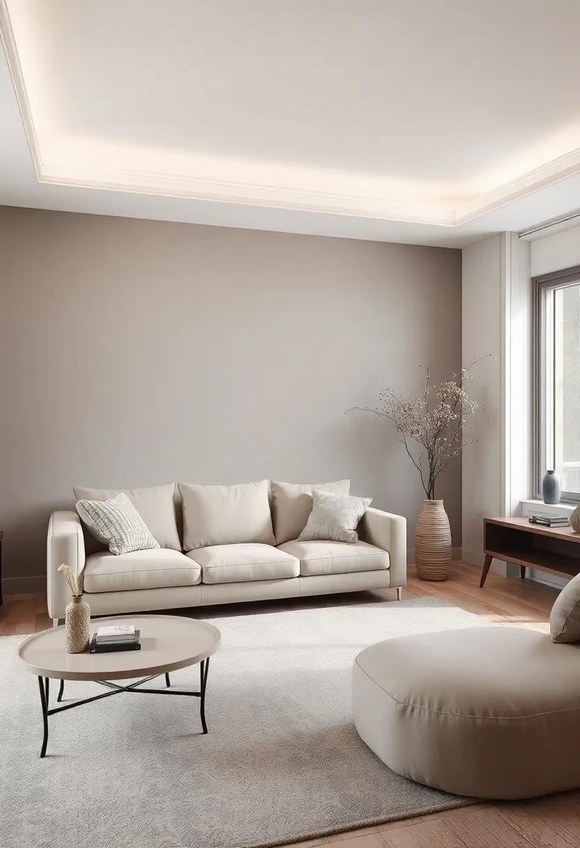
Cool Taupe: A blend of gray and brown, taupe offers a neutral backdrop that enhances other design elements
With its intriguing mix of gray and brown, this versatile hue brings a warmth and sophistication to living rooms that can smoothly complement any decor style. The charm of taupe lies in its ability to create a neutral backdrop which enhances the beauty of other design elements in the space. This makes it notably effective for pairing with vibrant furnishings or artistic accents. Imagine plush, colorful sofas or framed artwork standing out against taupe walls—each element becomes more pronounced and visually striking. When you choose taupe, you’re not just painting; you’re curating an experience of relaxation and elegance.
For those looking to incorporate taupe successfully, consider accenting with textures and materials that play with light and shadow. textured throw pillows, soft rugs, and wooden furniture can elevate the warmth of taupe, making your living room feel inviting and cohesive.Here’s how taupe synergizes with other complementary shades and materials:
| Accent color | Effect |
|---|---|
| Soft White | Lightens the room and provides a fresh contrast. |
| Dusty blue | Adds a touch of tranquility, perfect for a calm atmosphere. |
| Burnt Orange | Injects warmth and vibrancy, a nod to autumn hues. |
| Deep Green | Brings a natural, earthy feel that harmonizes with taupe. |
Muted Gold: Infuse a hint of luxury with this soft metallic shade, ideal for creating a glamorous yet subtle ambiance
Muted gold is the perfect balance of elegance and warmth, creating a backdrop that whispers sophistication without overwhelming the senses. When applied to your living room walls, this soft metallic hue captures and reflects light in a way that enhances the space’s dimensions while maintaining a cozy atmosphere. It pairs effortlessly with both customary and modern decor, allowing for versatility in styling that ensures your living area feels both inviting and luxurious.
To complement muted gold walls,consider incorporating furnishings and decor that enhance its richness: soft whites,deep navy blues,or earthy greens. These colors not only contrast beautifully with the golden tone but also contribute to a harmonious palette.Textured textiles like velvet or silk add depth, while metallic accents in furniture or artwork can sync perfectly with the muted gold, creating a cohesive look. Here’s a quick overview of key elements to harmonize with this stunning color:
| Element | Suggested Colors |
|---|---|
| Furnishings | Soft White, Deep Navy, Rich Burgundy |
| Textiles | Emerald Green, Charcoal Gray, Cream |
| Accents | Brass, Copper, Antiqued Silver |
Powdered Blue: A serene and airy color that can make rooms feel larger while maintaining a calming environment
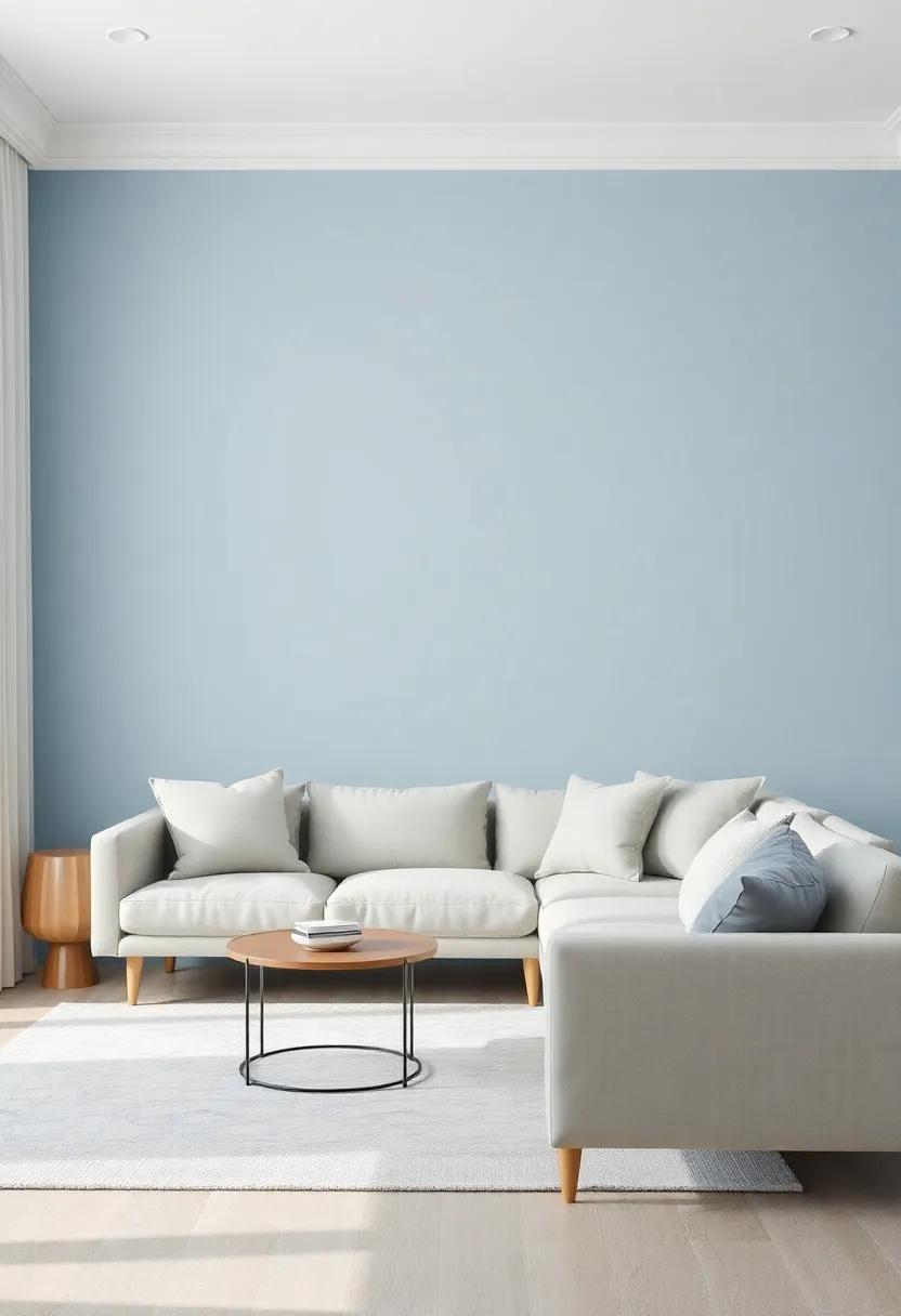
Imagine stepping into a living room that embraces you with a gentle hue, calming your senses while expanding your space. Powdered blue does just that, its soft tones creating an illusion of spaciousness that can make any room feel more open and airy. Whether paired with natural wood accents or sleek modern furnishings,this tranquil shade can transform your space into a serene retreat. You might consider complementing it with neutral whites or soft grays to enhance its ethereal quality, allowing natural light to bounce around and fill the room with vibrancy and life.
To further elevate your living room’s aesthetic, consider incorporating accents that harmonize with this soothing color. Think about introducing decorative elements in warmer tones, such as golden yellows or earthy greens, for a balanced interplay that infuses warmth into the coolness of powdered blue. Textiles like plush sofas, elegant drapes, or intricate rugs in complementary shades can add texture and depth, enhancing that cozy yet open ambiance. Here’s a quick overview of colors that pair beautifully with powdered blue:
| Accent Color | Description |
|---|---|
| Soft Gray | Creates a modern and sophisticated look. |
| Warm Yellow | Adds a cheerful and inviting touch. |
| Earthy Green | Brings a fresh and natural feel. |
| Creamy White | Enhances brightness while maintaining warmth. |
Greige: A balanced mix of gray and beige that offers versatile elegance, making it a favorite for modern interiors
Greige, the harmonious blend of gray and beige, serves as a sophisticated backdrop that exudes both warmth and understated elegance. This unique color offers an extraordinary versatility, allowing it to seamlessly fit into various design themes ranging from contemporary to rustic. Its neutral essence makes it an ideal canvas for showcasing decorative elements, encouraging creativity in furniture selection and accessories. With a hint of gray to keep things modern and a touch of beige for comfort, greige softens the harshness frequently enough associated with more stark shades while bringing a sense of tranquility to the living space.
In addition to its aesthetic appeal, greige creates a calming ambiance that invites relaxation and social interaction. One of its most appealing qualities is how it interacts with light, shifting its tone throughout the day—from a cozy taupe in the sunlight to a cooler, more sophisticated gray in the evening. This dynamic nature empowers homeowners to play with various textures and colors, enriching the space with layers of interest. Pair greige with complementary hues such as deep navy, olive green, or dusty rose for a harmonious palette that enhances your living area’s sophistication.
Soft Lavender: This delicate shade of purple radiates subtle charm and sophistication, perfect for relaxation
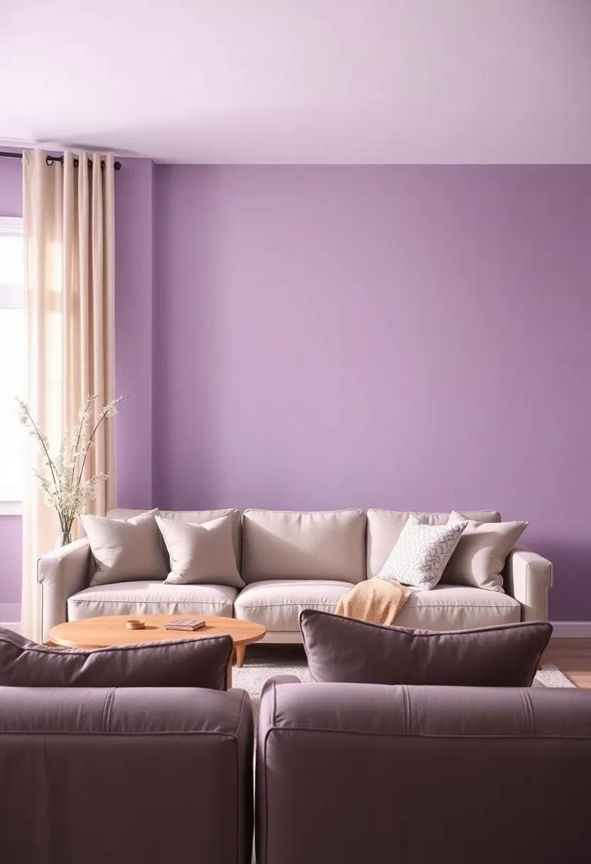
Soft lavender envelops your living room in a gentle embrace, promoting tranquility and a sense of calm, making it an ideal backdrop for relaxation. This delicate hue resonates sophistication while maintaining an understated elegance. Whether paired with natural wood accents or plush fabrics, it creates an inviting atmosphere that encourages conversation and connection. Imagine curling up on a soft sofa adorned with pastel pillows while the soft lavender walls lend a sense of serenity to your space, making it your personal oasis.
To enhance the charm of soft lavender,consider incorporating complementary decor elements that accentuate its beauty:
- Creamy Whites: Use white trim or furniture pieces to create a crisp contrast that brightens the room.
- Earthy Greys: Pair with soft grey tones for a balanced, modern look that feels timeless.
- Deep Plums: Accent with deeper shades to add depth and richness against the delicate lavender background.
- Natural Textures: Woven baskets, wooden accents, and linen fabrics help ground the lightness of the hue.
| Accent Color | Effect |
|---|---|
| creamy Whites | Crisp and fresh contrast |
| Earthy Greys | Modern and sophisticated feel |
| Deep Plums | Richness and warmth |
| Natural Textures | Grounding and inviting atmosphere |
Pebble Gray: Evoking the serene colors of a riverbed, this muted gray creates a peaceful and grounding space
Pebble Gray channels the soothing essence of nature, drawing inspiration from the gentle hues found along a riverbed. this soft, muted gray envelops a space with an earthy tranquility that invites relaxation.Its subtle undertones make it an ideal backdrop for both traditional and contemporary decor styles.The versatility of pebble Gray allows it to harmonize beautifully with a variety of accent colors ranging from deep navy blues to soft blush pinks,making it an exceptional choice for living rooms that prioritize both sophistication and comfort.
Incorporating this color into your living room can transform the ambiance, evoking a sense of calm and grounding. Not only does it support an open and airy feel, but it also serves as an elegant foundation for showcasing art and furniture elements.When paired with natural textures like wood and linen, the decor achieves a cohesive look that reflects both style and serenity. Consider the following accents to enhance the tranquil vibe of Pebble Gray:
- Warm wood tones: Complement the gray with oak or walnut finishes.
- Soft textiles: Add plush cushions and throws in muted pastels for a cozy touch.
- Natural plants: Introduce greenery for vibrancy and to connect with nature.
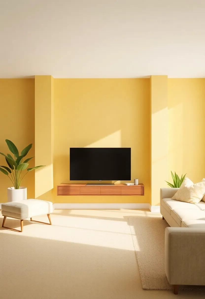
Faded Yellow: Bring a touch of sunshine indoors with this pale yellow, creating warmth without overpowering the room
A soft, faded yellow hue can transform your living space into a cozy refuge, fostering an inviting atmosphere that envelops you in warmth. Its gentle brightness mimics the sun’s glow, adding a refreshing layer to your decor without overwhelming the senses. When paired with natural elements like wood and greenery, this shade can evoke feelings of serenity and happiness, making it an excellent choice for a living room that doubles as a gathering place.
Consider accenting your faded yellow walls with decor in complements such as charcoal gray, cream, or muted blue. This versatile color works beautifully in both modern and traditional settings, allowing for a myriad of design possibilities. Try incorporating texture into your space with patterned cushions, soft throws, or intricate artwork that features hues from the wall. To further highlight the warmth, utilize warm lighting fixtures that create a welcoming ambiance during the evening hours.
| Element | Complementary Color |
|---|---|
| Decorative Accents | Charcoal Gray |
| Cushions | Cream |
| Artwork | Muted Blue |
| Lighting fixtures | Warm White |
Blush Beige: Combining soft pink and beige, this color exudes a gentle warmth, perfect for a cozy living area
Infuse your living space with a touch of elegance by embracing a color that beautifully melds warmth and comfort. The subtle allure of rosy undertones combined with soft beige creates a soothing backdrop, perfect for relaxation. Imagine sinking into a plush sofa adorned with cozy textiles against walls that reflect the serene hues of nature at dusk. This color scheme fosters an inviting atmosphere, encouraging leisurely conversations and intimate gatherings.
To enhance this gentle palette, consider complementing it with natural wood accents and pops of greenery. Furnishings in light woods, such as oak or birch, harmonize wonderfully while maintaining a light and airy feel. Pairing this nuanced shade with rich fabrics can elevate your decor, showcasing items such as:
- Soft velvet cushions in deeper blush shades
- Knitted throws in contrasting cream or taupe
- Handwoven area rugs in subtle geometric patterns
Creating harmony with the right lighting is essential; choose warm incandescent bulbs to cast a flattering glow over your living area. Alternatively, here’s a simple table to help guide you in selecting decor pieces that complement this enchanting shade:
| Item | material | Color Accents |
|---|---|---|
| Cushions | Velvet | Deep Rose, Beige |
| Throws | Knitted Wool | ivory, Light Taupe |
| Rug | Wool Blend | Muted Cream, Beige Patterns |
Muted Teal: A deep, rich color that adds depth and a sense of tranquility to your living room decor
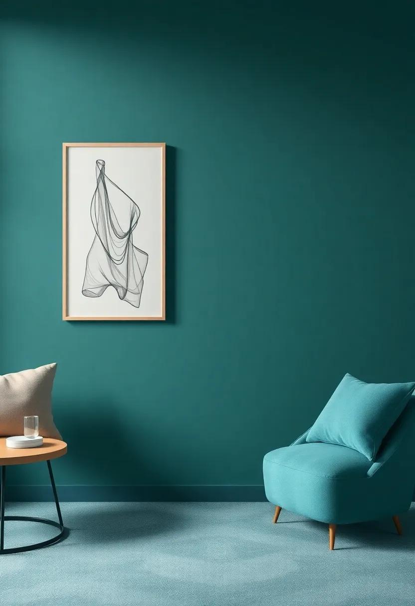
Imagine stepping into a living room cloaked in a soothing layer of muted teal, a color that evokes a sense of calm and sophistication. This rich hue is ideal for creating a serene retreat from the bustle of everyday life. Its deep undertones lend a touch of elegance, while the subtlety of its muted nature ensures it remains versatile enough to complement an array of decorating styles. Pair muted teal with elements like soft white trims or light wood furnishings to enhance its depth and create a harmonious balance within your space.
In terms of decor, this captivating color opens the door to a variety of aesthetic pairings. Consider incorporating these design elements:
- Textured Fabrics: Add plush cushions or a woven throw in complementary colors to soften the look.
- Artwork: Hang abstract pieces featuring gold or metallic accents to introduce a modern twist.
- Greenery: Incorporate houseplants that bring organic warmth and life to the muted palette.
- Lighting: Opt for warm-toned fixtures that create a cozy atmosphere against the calming backdrop.
| Element | Effect |
|---|---|
| Textured fabrics | Softens and enhances coziness |
| Artwork | Adds a focal point and modernity |
| Greenery | Brings life and energy into the space |
| Lighting | Creates warmth and ambiance |
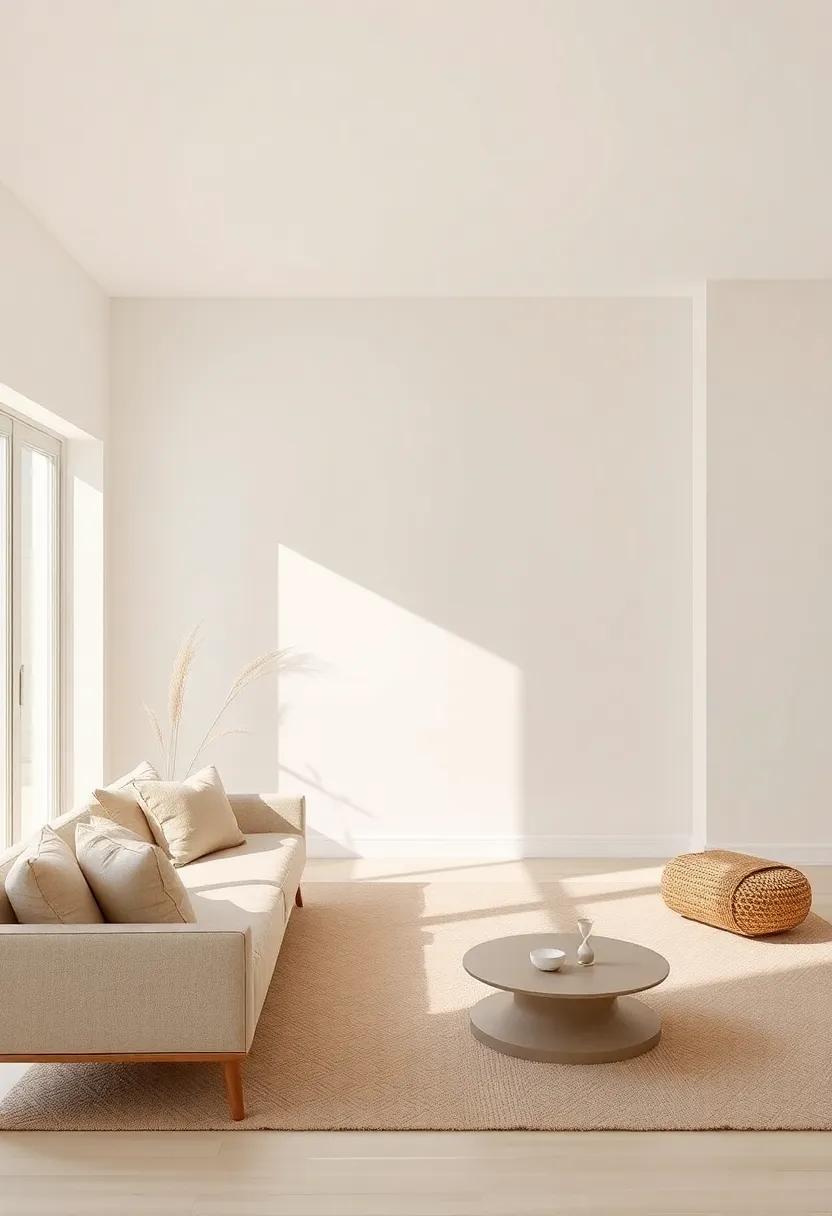
Whisper White: A soft white with just a hint of color, this shade creates an airy feel while remaining sophisticated
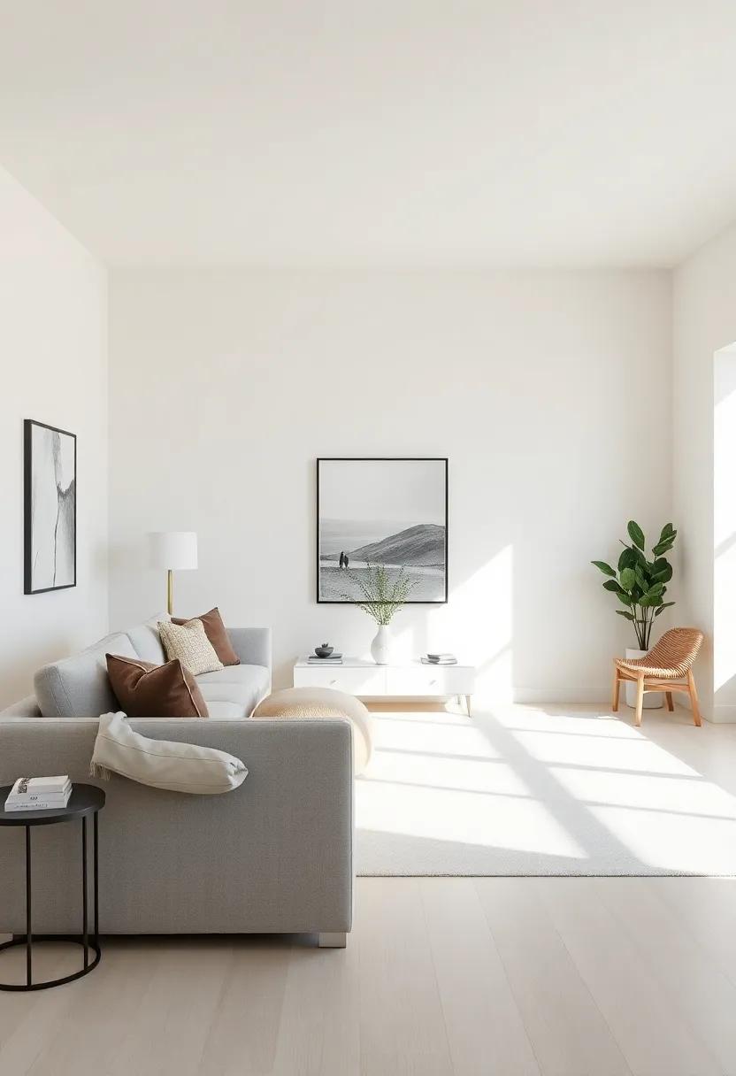
Whisper White is the kind of shade that brings an ethereal touch to your living space, acting as a perfect backdrop for various design elements. Its subtle hint of color makes it versatile enough to complement both modern and classic furnishings. This hue provides a sense of openness, making rooms feel larger and more inviting. Paired with rich textures and warm woods, it enhances the sophistication of your living room, transforming it into a serene sanctuary.
To maximize the elegance of Whisper White, consider layering various textures in your decor. Soft furnishings, such as plush sofas and woven throw pillows, can create a cozy yet polished atmosphere.Incorporate metallic accents—think brass lamps or silver picture frames—to add a touch of glamour without overwhelming the serene palette. Here are some complementary elements that work beautifully with Whisper White:
- Natural wood Tones: Warm oak or walnut furniture to ground the look.
- Soft Textiles: Cream or beige fabrics to maintain a cohesive theme.
- Accent Colors: Subtle pastels or muted jewel tones for a pop of personality.
- Artwork: Black-and-white photography or abstract pieces that stand out against the light backdrop.
Classic Navy: This deep blue brings a refined edge to any room, perfect for creating a feature wall
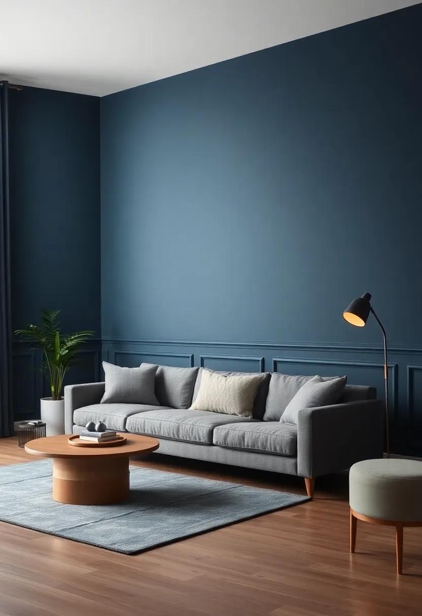
Incorporating a deep blue hue into your living room can instantly elevate the atmosphere, transforming a mundane space into a sophisticated retreat. This color embodies elegance, making it an ideal choice for a striking feature wall. Pair it with soft neutrals such as beige or ivory to create a captivating contrast that draws the eye without overwhelming the space. To enhance the richness of the navy, consider adding accents in metallic gold or silver, which can reflect light and create a sense of depth and luxury.
when decorating with this timeless shade, think about incorporating various textures to add warmth and interest. Layering fabrics like plush throws or silk pillows in lighter shades can soften the intensity of the navy, making the room inviting. For a cohesive look, utilize complementary colors in your artwork or decorative objects. A simple table of color pairings can help visualize the possibilities:
| Accent Color | Visual Effect |
|---|---|
| Soft White | Adds brightness and space |
| Mustard Yellow | Brings warmth and cheer |
| Blush Pink | Introduces softness and romance |
| Muted Gray | Provides a modern, sophisticated touch |
Stone Gray: A warm and inviting gray that complements wood accents, making your space feel natural and serene
stone Gray serves as the ideal backdrop for creating a cozy living space that radiates warmth and relaxation.Its soft, earthy tones blend seamlessly with natural materials, particularly wood, helping to enhance the overall texture and feel of the room. Whether you choose to incorporate reclaimed teak furniture or modern oak accents,Stone Gray harmonizes beautifully,creating an inviting atmosphere that invites leisurely moments with family and friends. The subtle nuances in its hue evoke feelings of peace and tranquility, making it perfect for a soothing living room environment.
To truly benefit from Stone Gray’s versatile nature, consider pairing it with decor that reflects organic elements. Textiles, artwork, and accessories in muted colors such as soft pastels or deeper earth tones will enrich the aesthetic while maintaining sophistication. Here are some design tips to best utilize this captivating shade:
- Natural Wood Accents: Incorporate wooden furniture pieces or wall shelves to create depth.
- Layered Textures: Combine different fabrics like linen, cotton, and wool for a cozy feel.
- Accent Colors: Use rich greens or deep blues in cushions or throws to bring life to the gray.
- Lighting Choices: Soft white or warm-toned lighting can enhance the welcoming vibe of your space.
| Element | Purpose |
|---|---|
| Accent Pillows | add color and comfort |
| Area Rugs | Define spaces and add warmth |
| Wall Art | Create interest and focus |
| Plants | Bring life and freshness |
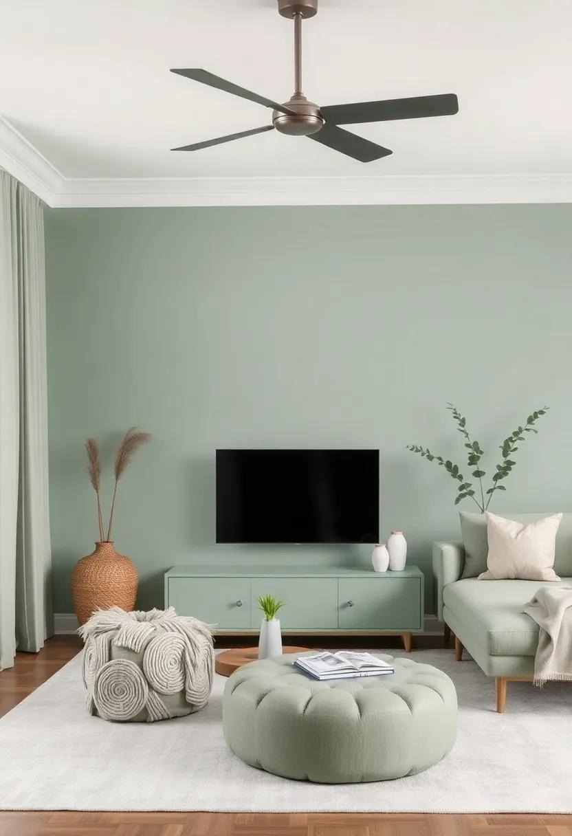
Sage Mist: A lighter variation of sage green, offering a fresh and organic vibe suitable for airy, light-filled spaces
For those yearning for an inviting and calm atmosphere,this lighter hue brings a sense of tranquility to any living space. Its airy essence effortlessly infuses rooms with natural light, making it the perfect backdrop for a cozy gathering or a serene moment of solitude. Imagine the soft glow of morning sunlight filtering through sheer curtains, highlighting subtle textures and decorations that play off the muted tone.From crisp white trim to earthy wooden accents, this color harmonizes beautifully with a variety of materials and styles.
To enhance the organic vibe further, consider incorporating these elements into your decor:
- Textured fabrics like linen and cotton for cushions and throws
- Natural wood furniture to bring warmth to the space
- Greenery in woven baskets or ceramic pots to echo the color’s inspiration
- Layered lighting with soft pendant lights or floor lamps to create a welcoming ambiance
With careful selection of decor and furnishings, you can transform your living room into a peaceful haven, where the harmony of colors and textures unite effortlessly, allowing you to unwind and connect with the beauty of nature from the comfort of your home.
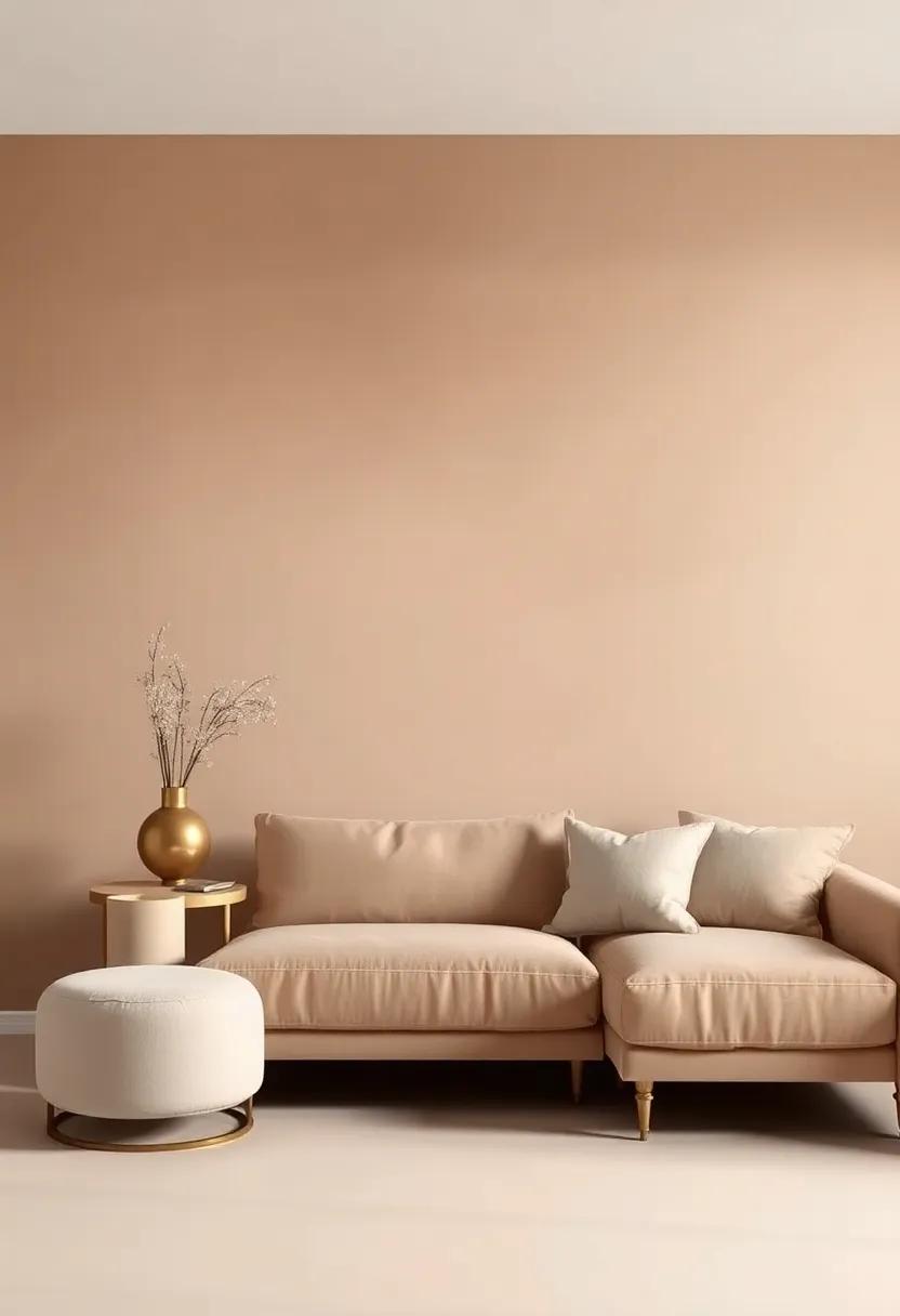
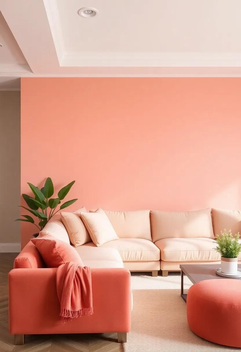
Wash of Peach: This muted orange brings warmth and a hint of playfulness without overwhelming the senses
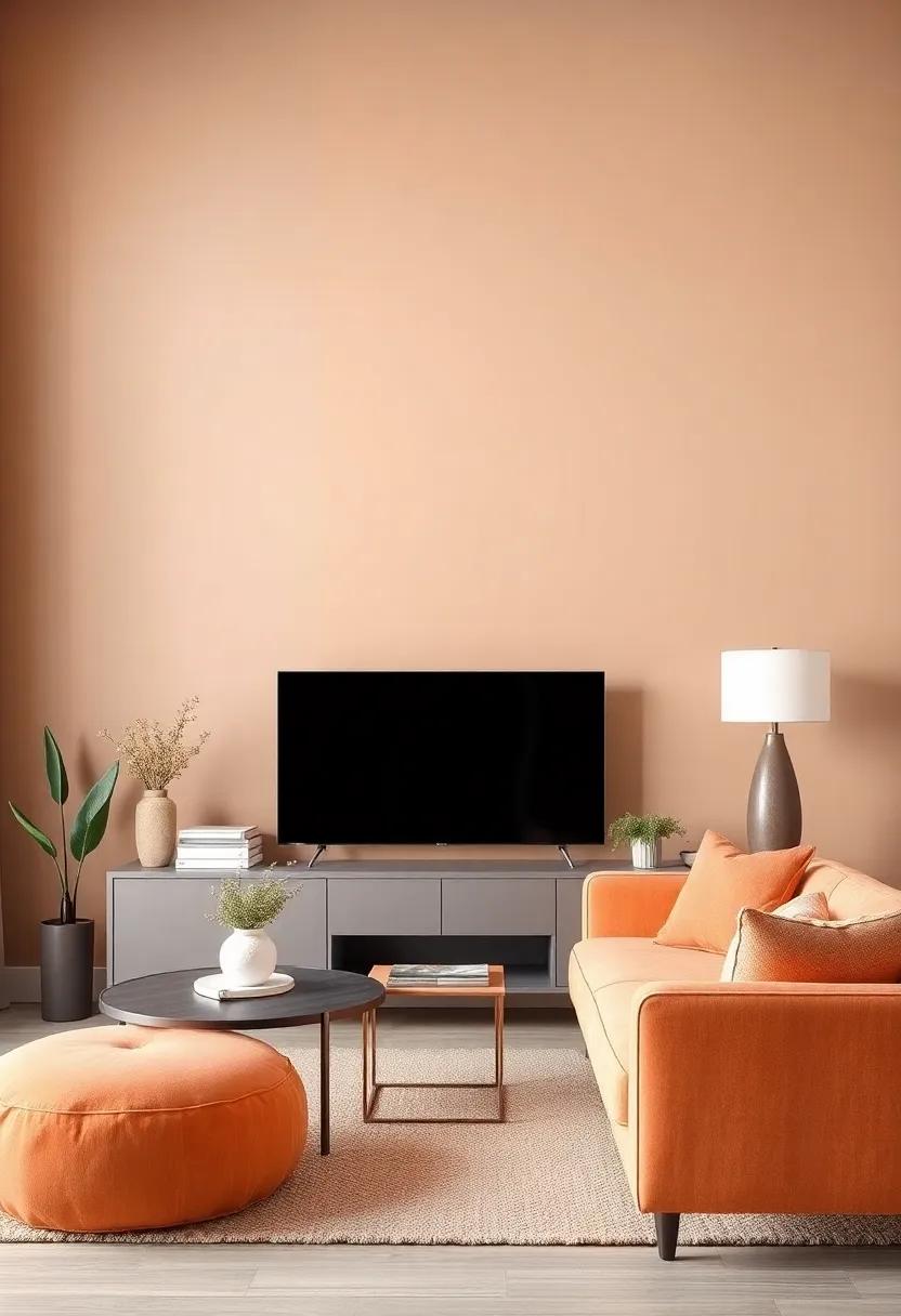
A wash of peach effortlessly transforms a living room into a cozy sanctuary, where warmth embraces all who enter. This soft, muted hue serves as a versatile backdrop, allowing other elements of décor to shine without competing for attention. The blend of orange and subtle pink undertones fosters a sense of playfulness that can be styled according to your personal aesthetic. Whether paired with natural materials or contemporary furnishings, the effect remains captivating yet soothing, perfect for encouraging relaxation while still feeling lively. Consider incorporating the following elements to enhance the appeal of a peach-hued living space:
- Neutral textiles: White or cream cushions and throws soften the peach walls.
- Natural Wood Accents: Light-colored wooden furniture complements the warmth of peach.
- Gold or Brass Accents: Metallic finishes add a touch of elegance and sophistication.
In addition to its aesthetic benefits,peach has a unique ability to harmonize differing styles while maintaining a cohesive look. This color works seamlessly with greens, blues, and even deeper jewel tones, creating a balanced environment that feels inviting. The adaptability of this shade allows for easy seasonal updates—swap out accessories for a burst of life in spring or bring in earthy tones for a cozy autumn feel. Explore these subtle yet impactful combinations for your peach-inspired living room:
| Color Pairing | Possible Decor Elements |
|---|---|
| Peach & Sage Green | Succulent plants, woven baskets, linen curtains |
| Peach & Charcoal Gray | Modern art, plush rugs, velvet accents |
| Peach & Navy Blue | Statement furniture, navy patterned cushions, artwork |
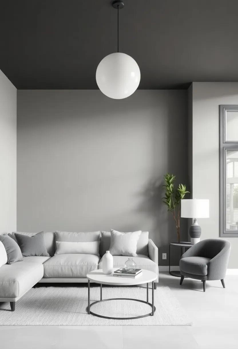
Subtle Charcoal: A darker gray that exudes elegance, perfect for balancing with lighter furnishings
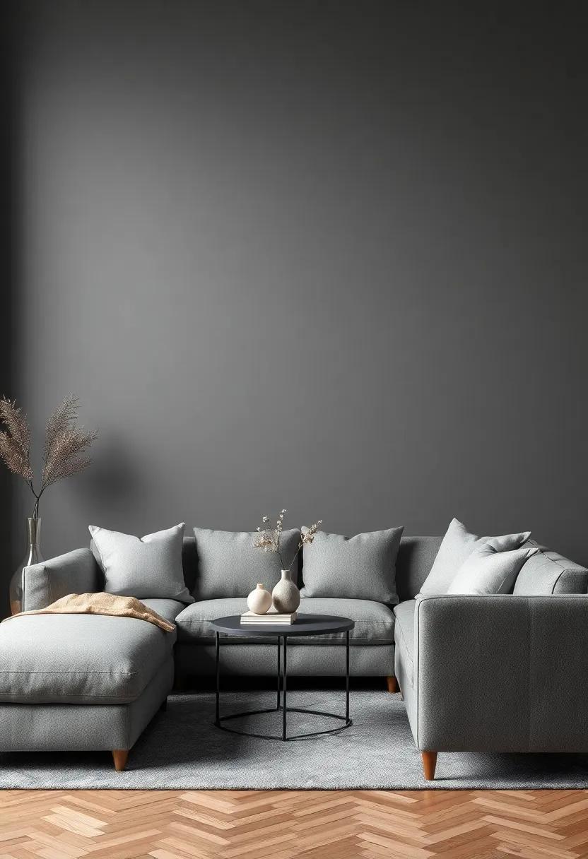
Imagine stepping into a living room cloaked in a sophisticated shade of dark gray that not only provides depth but also harmonizes effortlessly with lighter elements in the decor. This hue brings an air of understated luxury, making it perfect for a fine balance between cozy and sleek.With its rich tone, subtle charcoal can transform an ordinary space into an extraordinary retreat. Consider pairing it with furnishings and accents in lighter tones such as whites, creams, or soft pastels to create striking contrasts that draw the eye and add visual interest.
When contemplating the subtleties of this elegant color, think about incorporating various textures and finishes to enhance its appeal:
- Soft fabrics: Light linen curtains or plush throw pillows can soften the starkness of dark walls.
- Metallic accents: Gold or silver accents in fixtures or decor can bring a touch of glam to the understated palette.
- Natural elements: Incorporate wooden furniture or greenery to break up the monotony and add warmth to the space.
| color Pairings | Effect |
|---|---|
| White | Creates a clean, refreshing contrast. |
| Soft Pink | Adds a feminine, romantic touch. |
| Pale Blue | provides a calming, serene atmosphere. |
antique Ivory: A timeless shade that adds a vintage charm, creating a soft and welcoming environment
Antique ivory stands as a testament to the elegance of vintage aesthetics, imparting a soft warmth that beckons you into a serene living space.This gentle hue, characterized by its creamy undertones, effortlessly complements a variety of decor styles, from rustic farmhouse to refined coastal settings. When applied to walls, it creates a backdrop that feels inviting and cozy, encouraging relaxation and conversation among family and friends. The neutrality of antique ivory allows it to harmonize beautifully with an array of color palettes, enhancing accent pieces and furniture without overwhelming the senses.
Incorporating this timeless shade into your living room can transform it into an oasis of comfort. Consider pairing antique ivory walls with earthy tones or pastel furnishings to create a balanced and cohesive look.Here are some complementary elements to enhance the charm of your space:
- Wood Accents: Reclaimed wood furniture or decking adds texture and a touch of rustic charm.
- Textured Fabrics: Layering linen or cotton cushions in muted colors elevates comfort and visual interest.
- Vintage Artwork: Antique frames with classic paintings can add character and a story to your walls.
- Natural Elements: Incorporate plants or botanical prints to evoke a sense of nature and tranquility.
soft Seafoam: This soothing green-blue color is reminiscent of coastal retreats, perfect for creating a relaxing living space
Soft seafoam is a delightful hue that evokes feelings of tranquility, making it an ideal choice for your living room. This gentle green-blue shade, reminiscent of sunlit coastal retreats, helps create an inviting atmosphere where relaxation flourishes. Imagine sinking into your favorite couch, surrounded by walls painted in this calming tone. The natural and airy essence of soft seafoam works wonderfully with various decorative elements, allowing for an effortless blend of comfort and style.
When incorporating soft seafoam into your living room, consider pairing it with natural textures and organic materials. Here are some complementary design ideas:
- Warm woods – Use walnut or oak furniture to balance the soft color.
- Textiles – Choose cotton or linen fabrics in neutral tones to enhance the peaceful vibe.
- Accent colors – Introduce hints of coral or sandy beige for a seaside palette.
- Greenery - Incorporate indoor plants to add liveliness and warmth to the space.
To visualize the impact of this stunning color, check out the table below showcasing some popular paint brands and their soft seafoam shades:
| Brand | Color Name | Code |
|---|---|---|
| Benjamin Moore | Hebron Green | 2050-50 |
| sherwin-Williams | Sea Salt | 6204 |
| Farrow & Ball | Blue Green | 205 |
| Pantone | Soft Seafoam | 17-6030 |
dusty Mint: A soft version of mint that brings a refreshing touch while keeping the overall palette muted and refined
Dusty Mint is the epitome of elegance in a subtle hue, striking a perfect balance between refreshment and refinement. This soft shade of mint evokes the serene beauty of nature, reminiscent of a tranquil garden enveloped in gentle sunlight. Its muted tone makes it an excellent choice for living room walls, inviting a fresh breath of air into the space while ensuring the overall palette remains understated. Incorporating Dusty Mint can instantly uplift your living area, providing a calming backdrop for both bold and delicate decor elements.
To fully embrace this soothing color, consider pairing Dusty Mint with complementary shades that enhance its soft allure. Here are a few color pairings that can elevate your living room’s aesthetic:
- Warm Grays: Provide a cozy contrast.
- Creamy Whites: Create a light and airy feel.
- Muted Coral: Introduce a touch of warmth.
- Soft Taupe: Add depth without overwhelming.
Incorporating Dusty mint into your decor scheme can be achieved seamlessly through the use of textiles, furnishings, and decor accessories. A few thoughtfully chosen pieces—like plush cushions, elegant throw blankets, or minimalist art—can further accentuate this enchanting color, cultivating a sophisticated and timeless ambiance.
Creamy Mushroom: A versatile neutral that blends seamlessly with various styles, providing warmth and sophistication
If you’re seeking a wall color that exudes warmth and elegance, look no further than a creamy mushroom hue. This shade carries a delightful softness that effortlessly ties together various design elements in your living room, enhancing both traditional and contemporary aesthetics. Its rich, earthy tones bring a subtle richness to the space, inviting a sense of calm and relaxation. Paired with textured fabrics or sleek furniture, it creates an atmosphere that feels both inviting and polished.
incorporating this versatile neutral allows you to play with accents and themes without overwhelming the senses. Consider styling with natural wood pieces for a rustic touch,or opt for deep jewel tones to add a pop of color that stands out against the backdrop. This adaptability makes it easy to switch up decor with changing seasons or trends while maintaining a sophisticated look. Here are some ideas to enhance your creamy mushroom palette:
- Layered Textiles: Mix and match throws and cushions in varying textures.
- Accent Furniture: choose statement pieces in bolder colors to create visual interest.
- Wall Art: Incorporate organic shapes and abstract designs for an artistic flair.
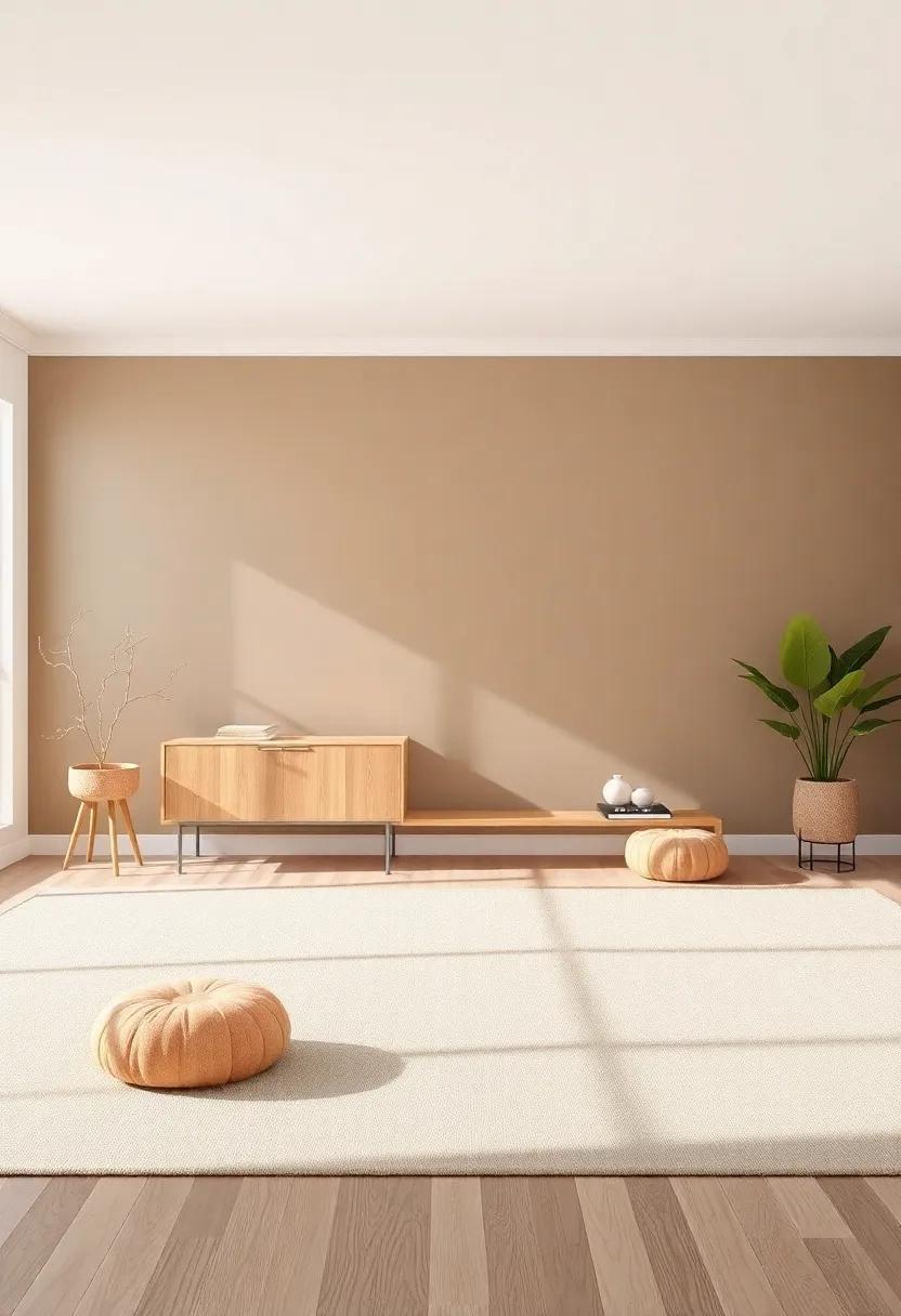
Earthy Mocha: This rich brown shade brings a sense of stability and warmth, ideal for creating a cozy living room
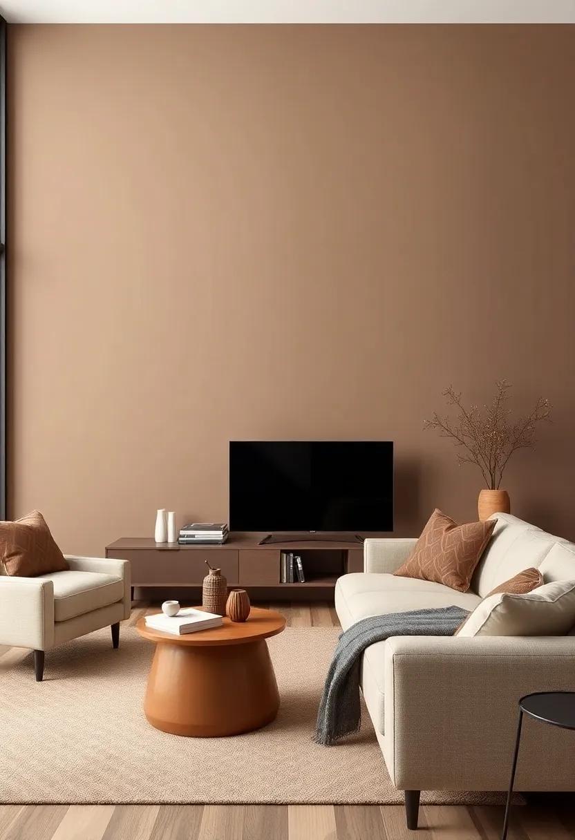
For those seeking to cultivate a sanctuary in their living spaces, this rich brown hue offers an ideal backdrop that exudes both stability and warmth.Its earthy undertones evoke a connection to nature,creating an inviting environment that encourages relaxation and conversation. The versatility of this color allows it to pair seamlessly with a variety of textures and materials, enhancing the coziness of your living room. Consider the following elements to elevate your space:
- Natural Wood accents: Incorporate furniture or decor in warm wood tones to harmonize with the brown shade.
- Creamy Textiles: layer in soft whites or creams through cushions and curtains to create contrast while maintaining warmth.
- Earthy Greenery: Add plants or botanical prints to bring life and a touch of nature indoors.
When lighting hits this deep, muted tone, it transforms the atmosphere, making it feel enveloping yet sophisticated. To further enhance this palette, experiment with these complementary shades: a muted dusty rose, soft sage, or even a gentle gray can balance the room, adding depth without overpowering the serene vibe. Use the table below as a guide for pairing colors effectively:
| Color Pairing | Effect |
|---|---|
| Dusty Rose | Warm and inviting atmosphere |
| Soft Sage | Brings a refreshing balance |
| Gentle Gray | Creates a calm and sophisticated look |
Lush Fern: A deep green that adds a hint of nature’s allure, bringing life to your space without being overwhelming

Incorporating a rich,deep green can transform your living room into a serene sanctuary,mimicking the tranquility of a lush forest. This hue embodies nature’s essence,providing a refreshing backdrop that evokes feelings of calmness and rejuvenation. Opting for this color as your focal wall or in accents allows you to embrace the outdoors while remaining sophisticated. The beauty lies in its versatility; whether paired with muted earth tones or soft pastels, it complements a variety of styles, from modern to rustic.
When styled thoughtfully, a deep green wall can elevate the ambience of your room while nurturing an inviting atmosphere. Consider the following elements to maximize the impact of this robust color:
- Natural Materials: Incorporate wooden furniture or rattan accents to harmonize with the green.
- Botanical Art: Use framed prints or canvases of plant life to draw attention to the wall’s allure.
- Textured Fabrics: Velvet cushions or linen curtains can soften the space, allowing the color to shine without overpowering it.
Here’s a quick reference table to assist you in selecting furnishings and decor that pair well with the rich green tones:
| Color Palette | Complementary Accents |
|---|---|
| muted Beige | Warm wooden tables |
| Soft Gray | metallic light fixtures |
| Dusty Blue | Textured throw blankets |
Lobster Red: A subtle take on red,this shade makes a bold statement while remaining elegant and refined
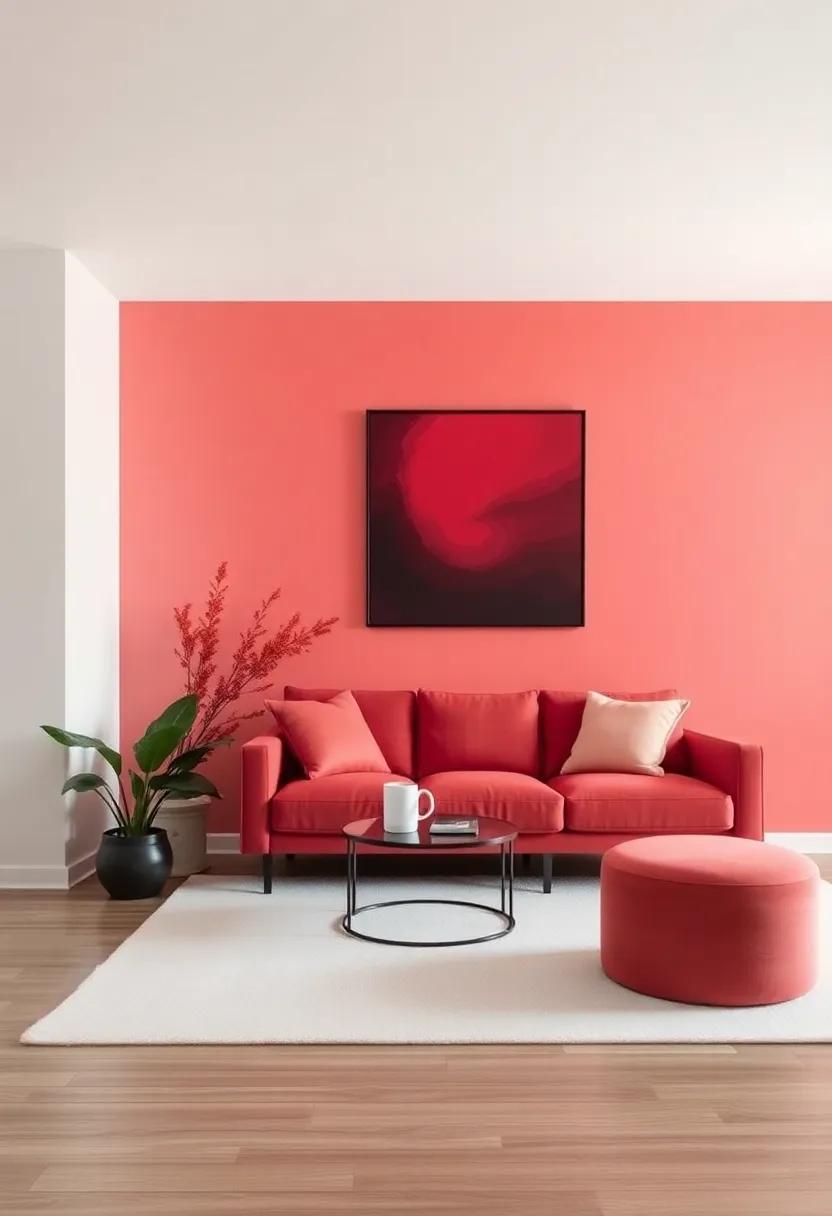
For those wanting to embrace the warmth of red without overwhelming the senses, Lobster Red serves as the perfect bridge. This sophisticated hue offers a splash of character while maintaining elegance, making it a standout choice for contemporary living rooms. When paired with neutral accents like cream and soft grays, this color transforms an ordinary space into a refined retreat.Picture rich mahogany furniture against these walls, creating an inviting atmosphere that’s perfect for family gatherings or intimate soirées.
To enhance the captivating allure of Lobster Red, consider incorporating a few key elements:
- Textured Fabrics: Velvet cushions and soft throws can add depth, echoing the richness of the wall color.
- Artistic Accents: artwork or decor in complementary shades like blush pink or muted gold can enhance the overall aesthetic.
- Soft Lighting: Warm light fixtures can highlight the subtle undertones of Lobster Red, creating an atmosphere of warmth and sophistication.
In addition, choosing the right palette can elevate the overall design. Here’s a simple breakdown of color pairings:
| Color Pairing | Effect |
|---|---|
| Cream | Softens the boldness, creating a calming contrast. |
| Muted Gray | Adds elegance without overpowering the primary shade. |
| Blush Pink | Injects a hint of playfulness while maintaining refinement. |
Frosty Gray: A cool, light gray that offers a modern touch, perfect for contemporary design aesthetics
Frosty Gray embodies a serene and airy essence, making it an excellent choice for those looking to elevate their living space with a modern twist.this cool,light gray serves as a canvas that reflects both style and sophistication. It harmonizes seamlessly with various decor elements, allowing you to incorporate an array of textures and materials while maintaining a clean, uncluttered aesthetic. Whether paired with sleek furniture or organic,rustic accents,Frosty Gray encourages a fluidity that is essential in contemporary design.
Consider integrating Frosty Gray into your living room for a fresh,inviting atmosphere. Here are a few design considerations to keep in mind:
- Accent Pieces: utilize darker shades to create contrast, such as deep navy or charcoal, to enhance the modern feel.
- Artwork: Choose dynamic,bold art that pops against the soft backdrop of Frosty Gray.
- textiles: Layer various textures with pillows and throws in contrasting colors, creating visual interest and warmth.
| Element | Suggestions |
|---|---|
| Furniture | Pair with sleek lines: consider metal or glass pieces. |
| Flooring | Natural wood or polished concrete works beautifully. |
| Lighting | Incorporate modern fixtures: think pendant lamps or floor lamps with a minimalist design. |
Misty Plum: A gentle purple that evokes a gentle serenity while adding a hint of drama to your decor
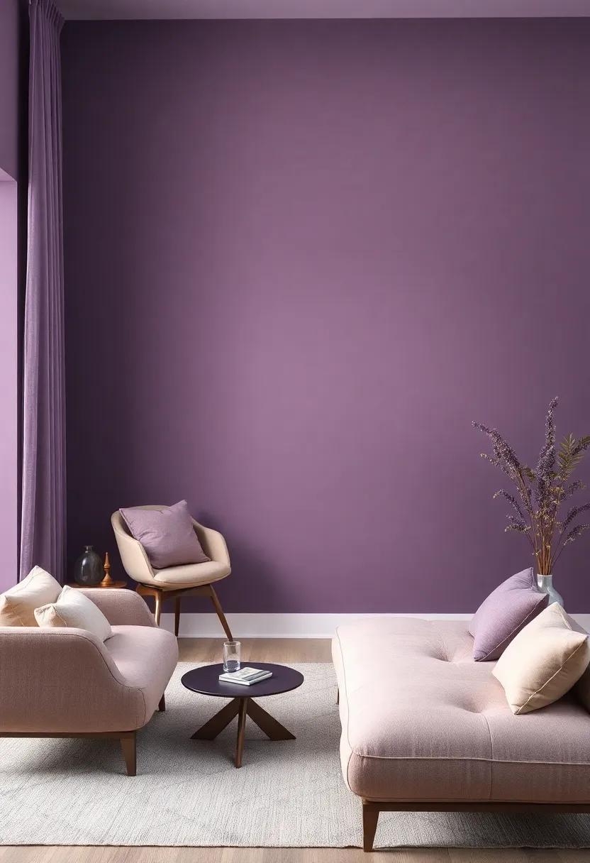
In the realm of interior design, few colors possess the elegance and depth of Misty Plum. This delicate hue strikes a perfect balance between soft serenity and a touch of theatrical sophistication, making it an excellent choice for living room walls. Imagine stepping into a space enveloped in this muted purple, where the atmosphere instantly feels serene yet adorned with a hint of drama. The versatility of misty Plum allows it to complement a variety of decor styles, from minimalist to eclectic, all while providing a subtle backdrop that enhances your furniture and accessories.
Using Misty Plum in your living room can usher in a profound sense of tranquility. Pair it with elements such as:
- Soft whites and creams to enhance light and brighten the space
- Rich wooden tones to create a warm, rustic feeling
- metallic accents like gold or bronze for a touch of glamour
- Natural textures such as linen or jute to ground the aesthetic
With its gentle presence, Misty Plum can also allow for creative layering in your decor. Consider complementary color pairings such as:
| Complementary Color | Effect on Decor |
|---|---|
| Soft Gray | Enhances tranquility and sophistication |
| Dusty Blue | Creates a calming coastal vibe |
| warm Taupe | Brings warmth and earthiness |
| Muted green | Invokes a refreshing, natural atmosphere |
Ultimately, embracing Misty Plum in your living room design results in a space that radiates serenity while effortlessly embracing a hint of drama—perfect for both quiet evenings and lively gatherings. This sophisticated tone opens the door to a decor style that is not only timeless but also deeply inviting.
Soft almond: This delicate beige invites a cozy and inviting atmosphere, bridging the gap between warmth and neutrality
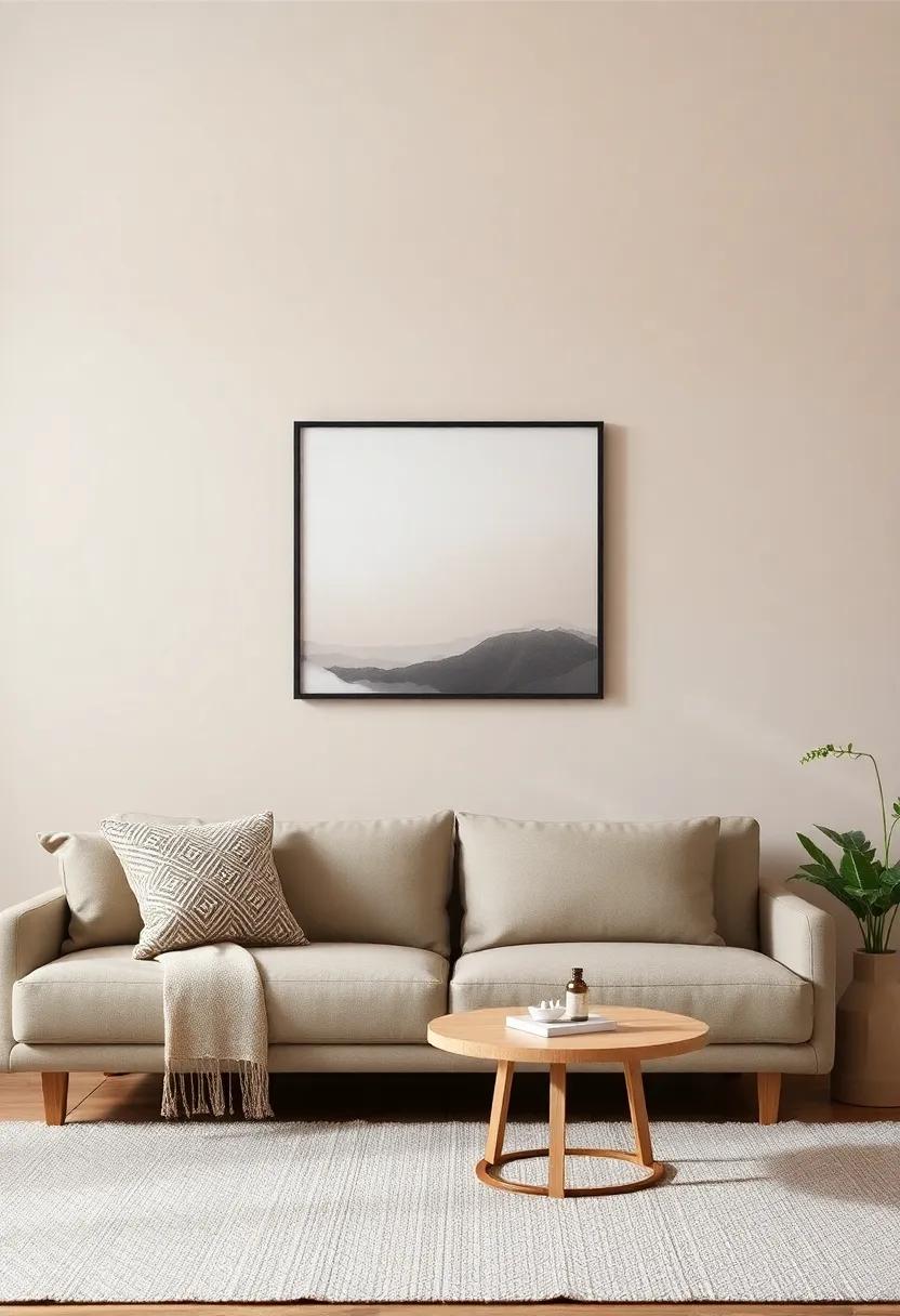
Soft Almond is the epitome of understated elegance, embodying a soft beige hue that wraps your living room in a warm embrace without overwhelming the senses.This sophisticated shade acts as a beautiful backdrop for a variety of design elements, allowing furniture and decor to shine without competing for attention. The versatility of Soft Almond means that it pairs exceptionally well with both earthy tones and cooler shades, making it a perfect bridge between warmth and neutrality.
Incorporating this delicate color into your space can create an inviting atmosphere that encourages relaxation and conversation. Consider accessorizing with natural materials such as wood or wicker to enhance the texture and warmth, or introduce cooler accents through art or textiles to balance the overall feel. Here are a few ideas to accentuate the charm of Soft Almond:
- Textured Fabrics: Use cushions and throws in soft cotton or linen for that layered effect.
- Warm Lighting: Opt for warm-toned bulbs to complement the richness of the beige.
- Artistic Touches: Choose artwork in gentle hues that harmonize with Soft Almond, drawing the eye without clashing.
- Indoor Plants: Introduce greenery to breathe life and vitality into your soft-colored space.
Delicate coral: A soft, muted coral that adds a splash of color without overshadowing the room’s overall elegance
Imagine stepping into a living room that balances warmth and sophistication,where the hues of the walls work in harmony to create an inviting atmosphere. A soft,muted coral serves as the ideal backdrop,offering just the right amount of color to enliven the space without overwhelming it. The understated charm of this shade brings a refreshing yet serene quality to the room,making it perfect for rooms designed for relaxation or intimate gatherings. Its delicate tone complements various decor styles, from contemporary to classic, enhancing the overall elegance of your living area.
When paired with carefully curated design elements, this gentle hue helps create a cohesive and tasteful aesthetic. Consider complementing muted coral walls with neutral furnishings such as creams and grays, or even rich, deep tones like navy or forest green for a striking contrast. To further elevate the elegance, you might want to incorporate accessories and artwork that feature similar coral undertones or natural textures. Below are a few key tips to maximize the beauty of this delightful shade:
- Accent with Metallics: Gold or brass accents can add a touch of luxury and warmth.
- Natural Elements: Incorporate wooden furniture or plants to enhance the organic feel.
- Layered Textiles: Fabrics in varying textures, such as soft linens or velvets, can add depth.
Sand Dune: A light and airy beige that mimics beachy landscapes, providing a relaxed and breezy feel to your living room
Imagine stepping into a living room where the walls evoke the gentle whispers of ocean breezes and the soft touch of warm sand beneath your toes. The hue akin to a sun-kissed beach creates an inviting atmosphere, seamlessly blending with your furniture and decor while promoting a serene environment. This tranquil beige color invites natural light to dance through the room,enhancing the airy feeling and making the space feel more expansive and open. As the sun sets, the warm tones of this shade embrace the room, making it a delightful haven for relaxation and gathering.
To fully embrace the essence of a coastal retreat, consider pairing this soothing shade with complimentary elements that echo the beauty of nature. Textures and materials play a crucial role in achieving the perfect balance. Here are some ideas to incorporate:
- Light Wood Accents: Wooden furniture in washed-out finishes can enhance the beachy vibe.
- Natural Fabrics: Linen or cotton throw pillows and curtains will maintain the airy feel while adding comfort.
- Earthy Decor: Incorporate elements like seashells, driftwood, or sandy-toned artwork to complete the serene look.
| Element | Description |
|---|---|
| Accessories | Keep it minimal with subtle beach-inspired themes. |
| Rugs | Opt for light, textured fabrics that mimic the feeling of sand. |
| Lighting | A warm, soft glow from lamps can mimic fading daylight by the shore. |
Final Thoughts
as we wrap up our exploration of the 29 muted living room wall colors, we hope you’ve found inspiration that resonates with your design aspirations. These understated hues not only create a backdrop of sophistication but also allow your personal style to shine through, transforming your space into a serene sanctuary.
Whether you lean towards the soft warmth of greys, the cool calmness of blues, or the inviting nature of earth tones, each of these colors opens the door to endless possibilities for decor and ambiance. Remember, selecting the right shade can elevate your living room, making it a timeless enclave where comfort and elegance coexist.
As you embark on your decorating journey, may these muted tones guide you in creating a living room that reflects your taste while standing the test of time. Happy decorating!