 Decorationg Interior Design
In the realm of interior design, the heart of the home—the kitchen—holds an extraordinary power to reflect personal style while combining functionality and warmth. As one of the most frequented spaces, kitchen aesthetics play a pivotal role in enhancing both everyday living and culinary creativity. Enter the trend of two-toned kitchen cabinets,a captivating design shift that elegantly marries color and creativity. This approach not only revitalizes kitchen spaces but also speaks to the modern homeowner’s desire for uniqueness and versatility.In this article, we’ll explore the allure of two-toned cabinets, uncovering how this design technique can transform your kitchen into a stunning focal point, all while embracing the balance of harmony and contrast.Prepare to be inspired as we delve into the world of color combinations, design tips, and the transformative potential of this stylish trend.
Exploring the Aesthetic Appeal of Two-Toned Kitchen Cabinets in Modern Design
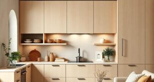
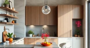
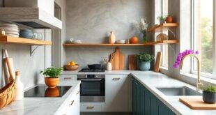
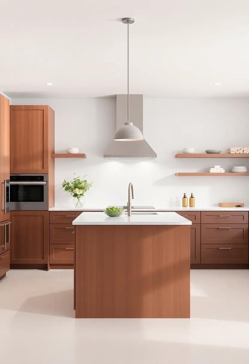
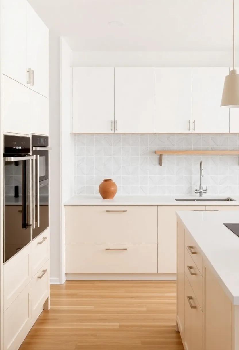
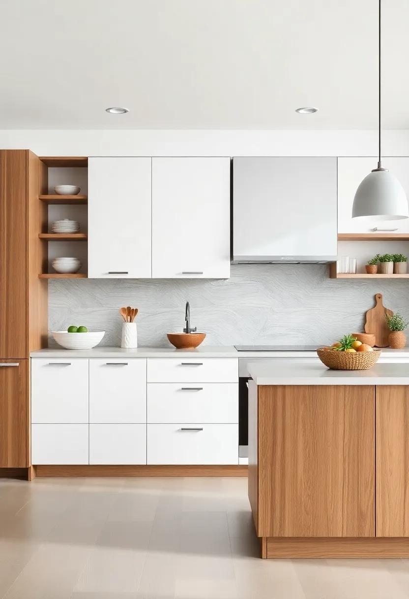
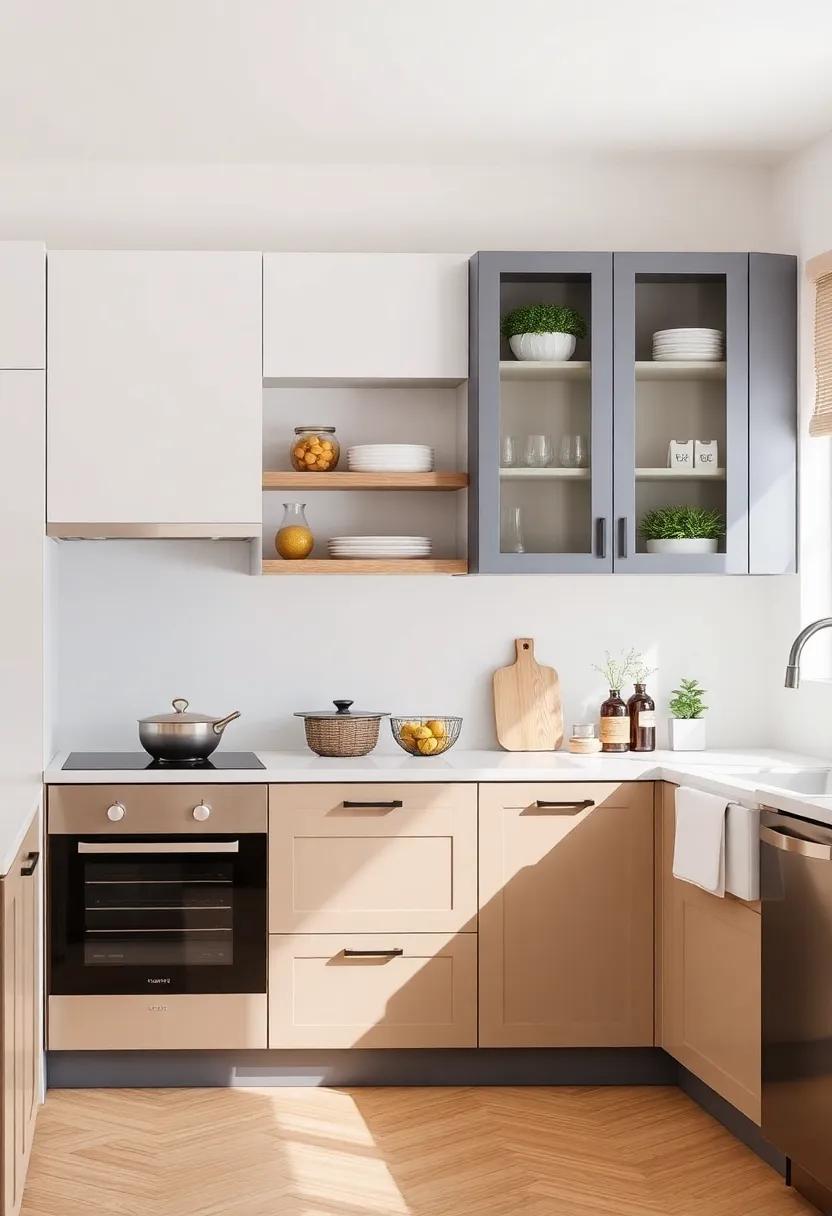
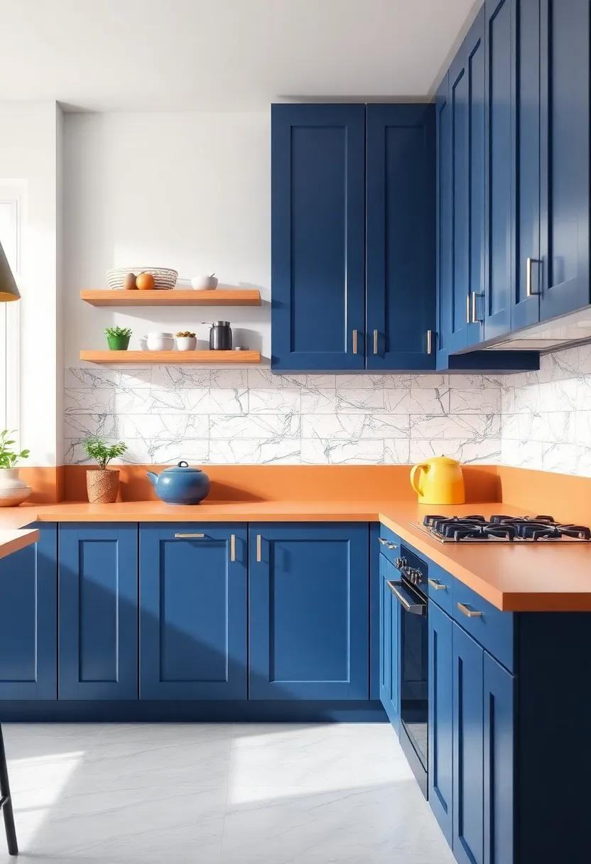
Two-toned kitchen cabinets are redefining modern home aesthetics by seamlessly blending form and function. The striking contrast between colors not only enlivens the space but also opens up avenues for creative expression. This design choice enables homeowners to personalize their kitchens, allowing them to choose a bold hue for the upper cabinets and a soft neutral for the lower ones or vice versa. The result is a visual narrative that adds depth and dimension,making the kitchen the heart of the home. These cabinets can serve as a perfect backdrop for accent features, such as stylish hardware or unique backsplash designs, further enhancing the overall appeal of the kitchen.
Implementing this design trend also allows for an easy transition between different styles and themes. A well-thought-out color palette can effortlessly tie together various elements of a home’s décor. Consider the following compelling combinations:
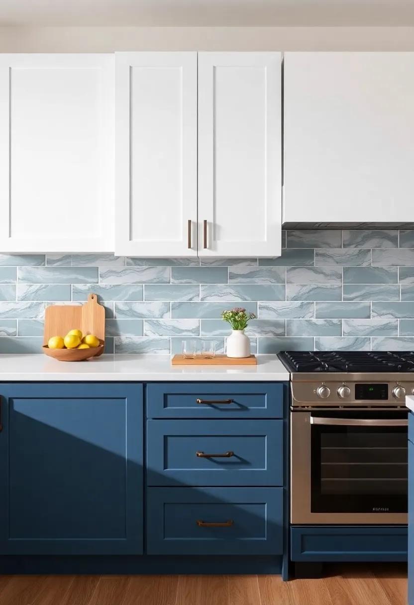
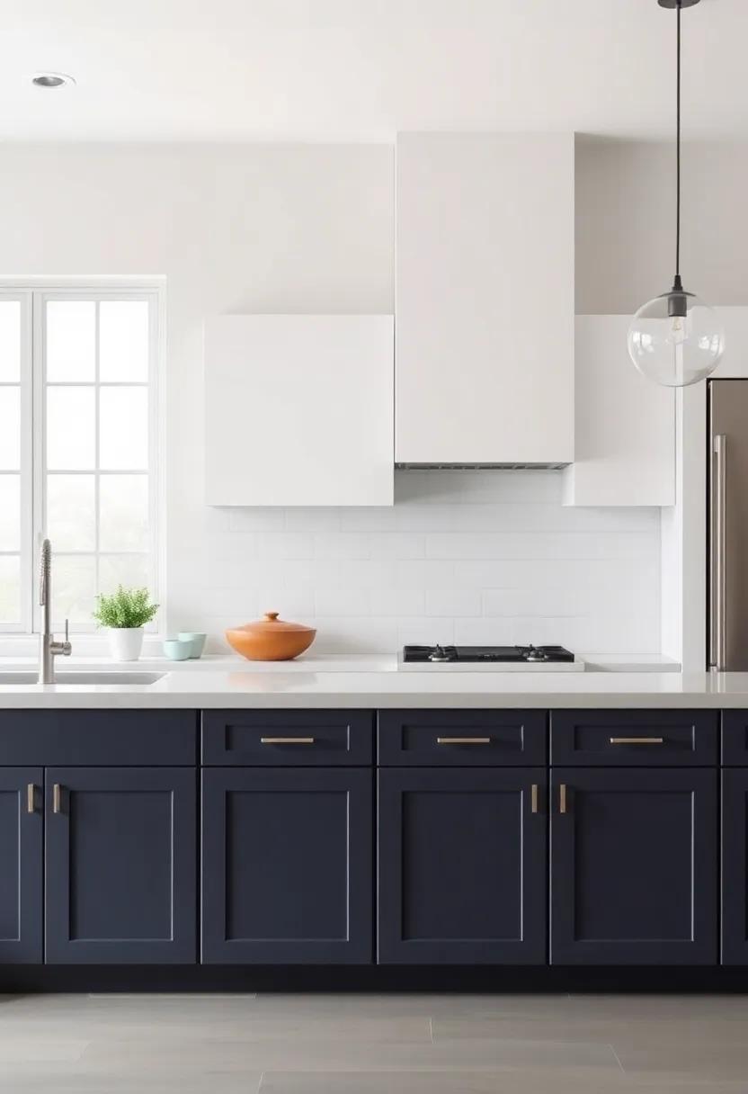
- Navy blue and White: Classic and elegant.
- Charcoal Gray and Soft Mint: A contemporary twist.
- Cream and Sage Green: Fresh and inviting.
This versatility makes two-toned cabinetry a favorite choice among designers and homeowners alike, as it invites an artistic flair that suits any modern lifestyle.
Navigating Color Psychology to Choose the Perfect Cabinet Combinations
When selecting cabinet colors for your kitchen, it’s essential to consider how different hues can impact the mood and atmosphere of the space. Blue hues frequently enough evoke feelings of tranquility and calm, making them ideal for a soothing surroundings, while yellow can stir up a sense of warmth and happiness, encouraging lively conversation.Pairing these colors can create a stunning contrast, allowing for an uplifting yet balanced ambiance. When designing your two-toned kitchen, think about incorporating shades that not only complement each other but also resonate with the emotions you wish to evoke.
To achieve a harmonious blend, consider the following combinations:
- white & Navy Blue: This classic combo offers a timeless elegance, enhancing natural light while adding depth.
- Charcoal grey & Soft Sage: A modern pairing that combines sophistication with a touch of nature, promoting a refreshing and contemporary vibe.
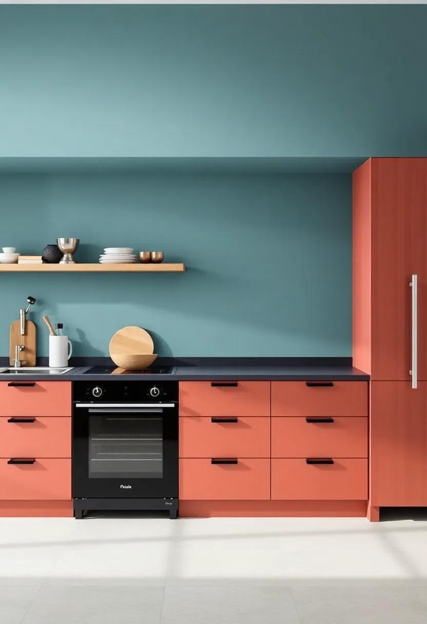
- Soft Peach & Cream: This warm duo brings a touch of softness to the kitchen while promoting a welcoming atmosphere.
| Color Combination | Psychological Effect |
|---|---|
| Blue & White | Calming, Relaxed |
| Gray & yellow | Modern, Cheerful |
| Teal & Tan | Natural, Inviting |
Balancing Light and Dark Shades for the Ultimate Kitchen visual Impact
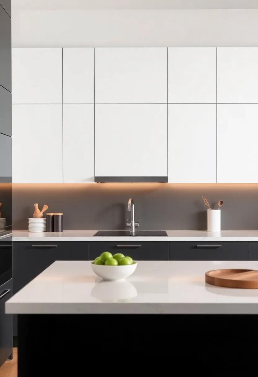
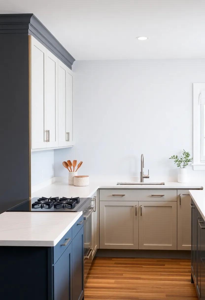
Combining light and dark shades in kitchen cabinets creates a captivating visual effect that elevates the entire space. By going with a contrasting palette,homeowners can achieve a sense of depth and sophistication. Popular pairings include sleek charcoal tones with soft whites or muted navy blues alongside crisp creams. this interplay of colors not only defines the space but also establishes a cohesive flow, allowing each shade to complement rather than overpower the other. Consider the following tips when choosing your combination:
- Balance proportions: Ensure that lighter shades dominate larger surfaces to keep the room feeling open.
- Accent strategically: Use darker shades for islands or lower cabinetry to ground the design.
- Match with hardware: Choose backsplash tiles and fixtures in complementary tones to enhance the overall aesthetic.
The use of a two-toned approach can also reflect personal style, from sleek modern designs to warm traditional vibes.Consider using a high-gloss finish for light colors and a matte texture for darker shades to create additional visual intrigue. This not only enhances the light and dark contrast but also simplifies maintenance and cleaning.To further illustrate effective combinations, the table below summarizes some trending pairings:
| Light Shade | Dark Shade | Effect |
|---|---|---|
| Soft White | Charcoal Gray | Modern Elegance |
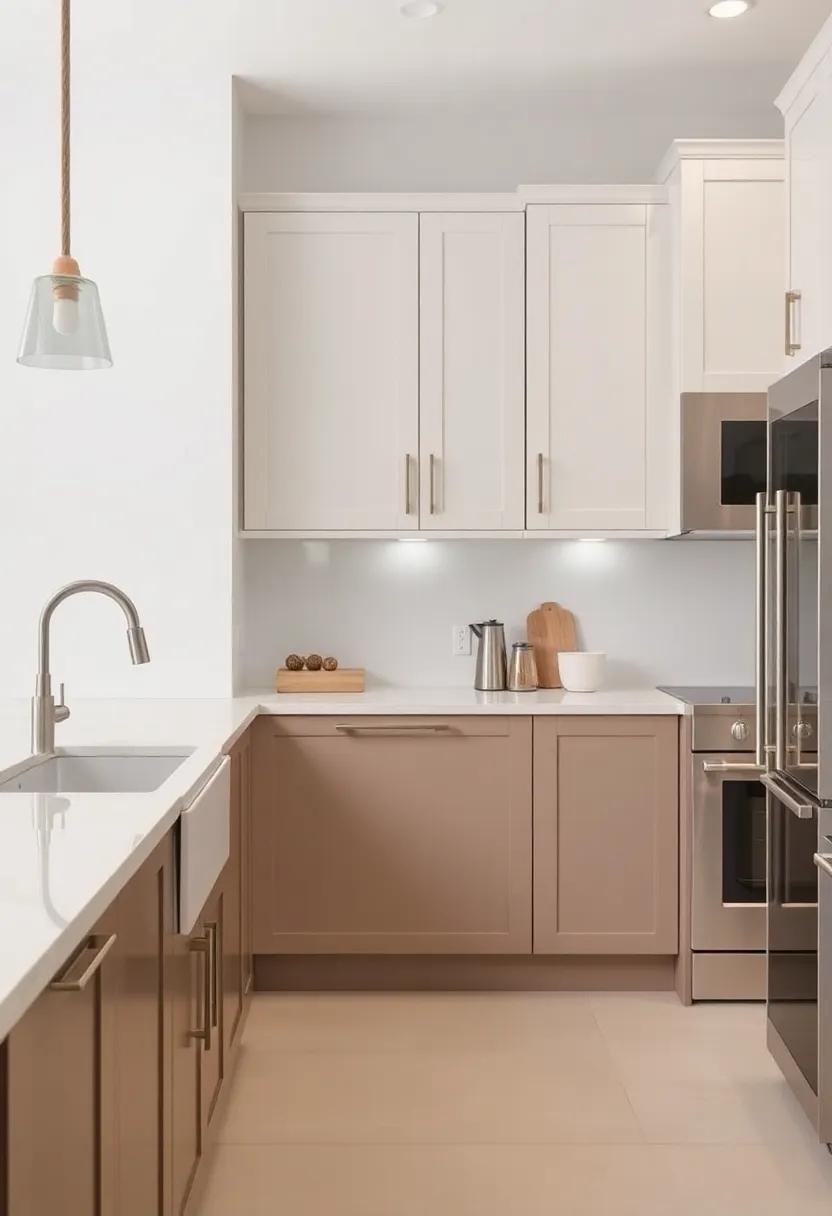
| Pale Beige | Deep Brown | Warm Intimacy |
| Light Sage | Forest Green | Natural Harmony |
| Blush Pink | Plum | Chic Sophistication |
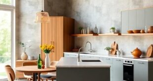
Creating Depth and Dimension with Two-Toned Cabinetry in Open Spaces
In modern interiors, the application of two-toned cabinetry can elevate the overall aesthetic, creating a seamless flow that enhances the perception of space. By choosing complementary or contrasting hues, homeowners can achieve a visually stimulating environment that captivates the eye. For instance, pairing dark lower cabinets with light upper ones can produce a striking balance, while adding a touch of sophistication to your kitchen or living area.This design technique not only highlights architectural features but also helps delineate different zones within open-concept spaces, making them feel more purposeful and organized.
The versatility of two-toned cabinetry enables you to express your personal style while maintaining a cohesive look. Here are some ideas to consider:
- Contrast with neutrals: A slate gray bottom with crisp white on top can lend a timeless feel.
- Play with Textures: Mix matte finishes with glossy ones for a more dynamic visual.
- Highlight Islands: Utilize bold colors on kitchen islands to create a focal point.
| Color Pairing | Visual Impact |
|---|---|
| Charcoal & White | Elegant and modern |
| Navy & Light Gray | Trendy yet classic |
| Mint & Natural wood | Refreshing and airy |
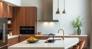
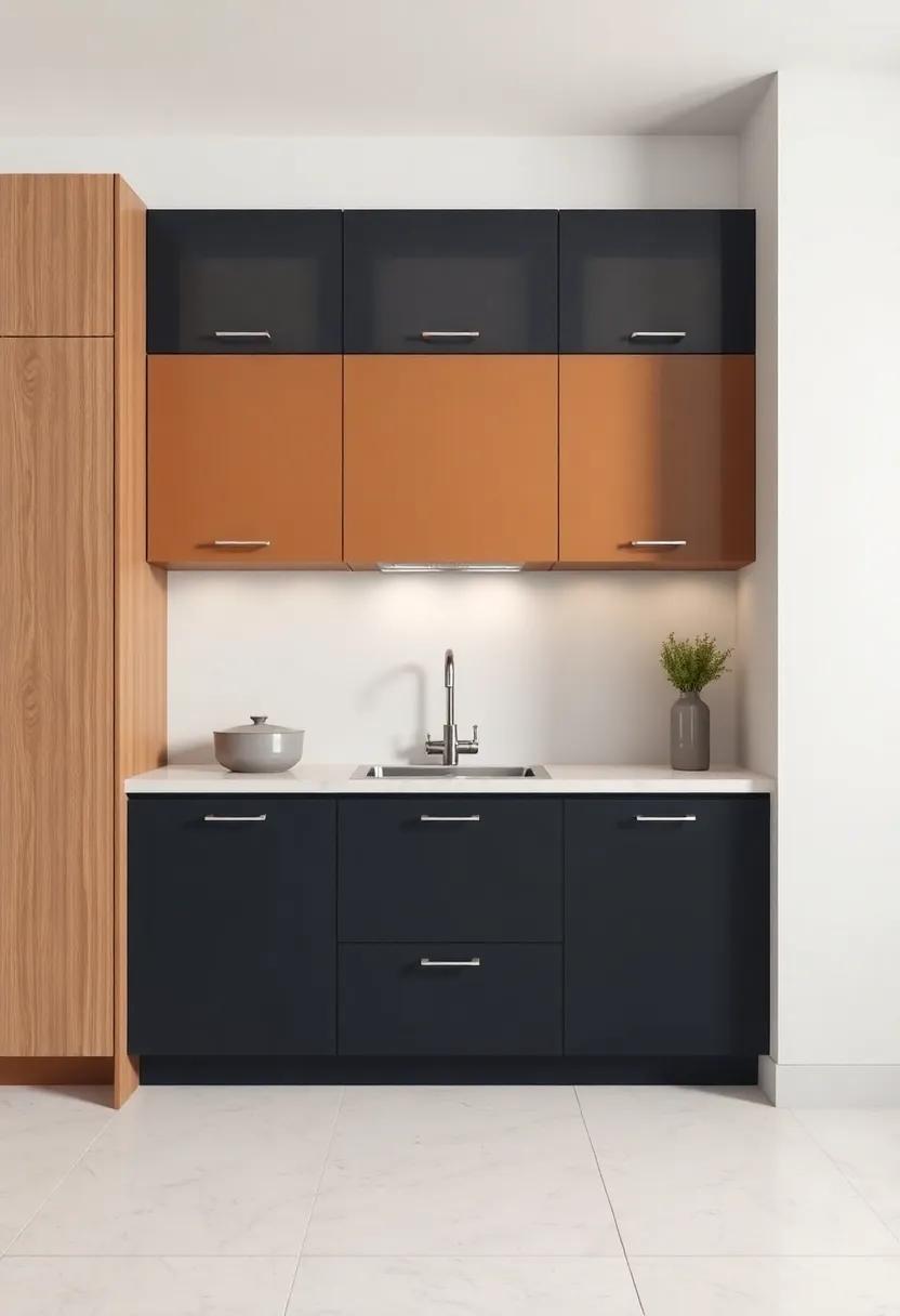
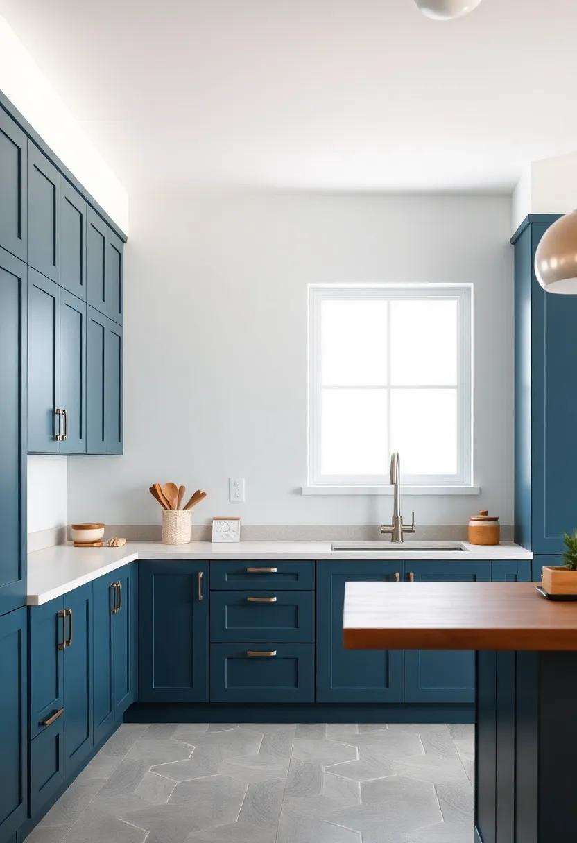
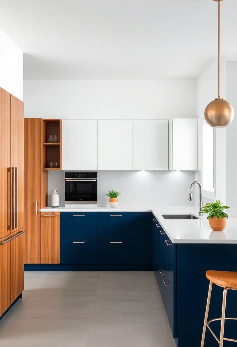
Elegance Meets functionality: Practicality of Mixed Cabinet Colors
In modern kitchen design, the combination of different cabinet colors brings a unique charm that transcends mere aesthetics, creating a vibrant yet functional space.By opting for a two-toned strategy,homeowners can effectively define zones within their kitchens. For example, lighter shades on upper cabinets can enhance visual space, while darker hues on lower cabinets contribute to grounding the overall look. This beautiful contrast not only captivates the eye but also offers practical benefits such as easier maintenance; lighter shades help mask dust and stains during day-to-day use.
Furthermore, mixed cabinet colors empower homeowners to express their personal style and adapt their kitchen to evolving trends without a complete overhaul. By layering colors creatively, one can establish a warm ambiance or a sleek, contemporary vibe. Consider the following practical advantages:
- Versatility: Easily change kitchen themes with seasonal decor.
- Highlight Details: Draw attention to unique architectural elements.
- Enhance Lighting: Optimize natural light reflections in the space.
| Color Pairing | Style Effect |
|---|---|
| white & Navy Blue | Classic Coastal Feel |
| Gray & Soft Sage | modern Minimalism |
| Charcoal & Light Oak | Warm Sophistication |
Incorporating Two-Toned Cabinet Designs in Various Kitchen Layouts
A two-toned cabinet design can seamlessly enhance various kitchen layouts, bringing depth and sophistication to any space. In an open-concept design, contrasting cabinet colors can delineate the kitchen area from the living or dining spaces, maintaining an airy feel while still allowing for visual interest.As a notable example, pairing dark lower cabinets with light upper cabinets creates a striking contrast that draws the eye upward, making the kitchen feel larger. Additionally, choosing cabinetry colors that complement your decor, such as navy and white or charcoal and blush, adds a modern touch without overwhelming the senses.
In more compact kitchens, incorporating two-toned cabinetry can work wonders for enhancing the room’s proportions. Using lighter shades on the upper cabinets and darker colors below can create an illusion of height, while open shelving can break the monotony and provide an opportunity for decorative displays. Below is an example of how to effectively use color combinations based on kitchen layouts:
| Kitchen layout | Ideal Color Combinations |
|---|---|
| Open Concept | Dark lower cabinets with light upper cabinets |
| Galley Kitchen | Two shades of the same color (light and dark) |
| U-Shaped | Bold colors with neutral accents |
This approach allows you to embrace the trendy aesthetic while optimizing function and style in your kitchen, creating a space that feels cohesive and inviting.
Setting the Stage: Choosing the Right Countertops for Two-Toned Cabinets
When embarking on the journey to select countertops for your two-toned cabinets, it’s essential to bring cohesion and balance to the overall design. Consider pairing lighter-colored cabinets with darker or more textured countertops to create a striking contrast that enhances the visual appeal of your kitchen. Conversely, if your cabinets showcase a bold hue, a neutral countertop can definitely help anchor the space, providing a sense of calm amidst the vibrancy. Here are a few material options to contemplate:
- granite: A classic choice that offers durability and unique patterns.
- Quartz: Known for its wide range of colors and low maintenance.
- marble: Elegant and timeless, perfect for a luxurious touch.
- Butcher Block: Adds warmth and natural beauty, ideal for rustic or farmhouse styles.
To further assist in your decision-making process, consider the following factors when selecting your countertops:
| factor | Granite | Quartz | Marble | Butcher Block |
|---|---|---|---|---|
| Durability | High | Very High | Moderate | Low to Moderate |
| Maintenance | Requires sealing | No sealing required | Requires sealing | Regular oiling needed |
| Cost | high | Moderate to High | High | Low to Moderate |
These choices can affect not just the aesthetic of your kitchen, but also its functionality and workflow. Ultimately, the perfect countertop will support the duality of your cabinets while inviting warmth and sophistication into the space.
Harmonizing Cabinet Colors with Backsplashes for a Cohesive Look
When designing a kitchen, the choice of cabinet colors can set the entire tone of the space, and pairing those with an equally well-considered backsplash is key to achieving a balanced and attractive look. A successful combination frequently enough emphasizes contrast or similarity, depending on the desired aesthetic. For example, rich, dark cabinets can be beautifully complemented by a light, airy backsplash, fostering a sense of depth. Alternatively, those who prefer a more monochromatic look might choose a backsplash in a shade that is just a few tones lighter or darker than their cabinets, creating a seamless transition that enhances the kitchen’s overall flow.
To effectively harmonize colors, consider these key elements:
- Material Compatibility: The texture of the backsplash materials should complement the cabinetry finish—matte finishes with matte, glossy with glossy.
- Color Wheel: Utilize the color wheel to find complementary shades; opposites can create an exciting contrast, while neighboring colors provide a more subdued approach.
- Design Patterns: geometric or patterned backsplashes work well with solid cabinets, while simple tile designs can enhance more complex cabinet styles.
| Cabinet Color | Recommended Backsplash |
|---|---|
| White | Marble or Mosaic Tile |
| Charcoal Gray | Glazed Subway Tile |
| Navy Blue | Light Gray Natural Stone |
| Natural Wood | Bright White Glass |
Integrating Hardware and Fixtures to Complement Two-Toned Cabinets
Pairing hardware and fixtures with two-toned cabinets can elevate your kitchen’s overall aesthetic, creating a seamless flow between different design elements. When selecting hardware, consider options that enhance the contrast and complement the color scheme. For a complex touch, brushed brass or matte black finishes work beautifully against lighter cabinets, while polished nickel or chrome can add a touch of sleek elegance to darker tones. Additionally, choosing cabinet knobs and pulls that share similar finishes helps maintain a cohesive look, allowing the two tones to shine without overwhelming your space.
lighting fixtures also play a crucial role in showcasing the beauty of your cabinetry. installing pendant lights above kitchen islands or task areas can introduce another layer of color and texture,especially when paired with fixtures that have glass or metallic elements. Consider the following styles for a harmonious blend:
| Fixture Type | Recommended Finish |
|---|---|
| Pendant Lights | Matte Black, Brushed Brass |
| Wall Sconces | polished Nickel, Soft White |
| Chandeliers | Antique Bronze, Gold Leaf |
| Under-Cabinet Lighting | Warm LED, Cool White |
by thoughtfully selecting both hardware and lighting, you can accentuate the unique charm of your two-toned cabinets, making them the focal point of your kitchen. A well-curated combination ensures that each element works in harmony, resulting in a space that is not only functional but also visually captivating.
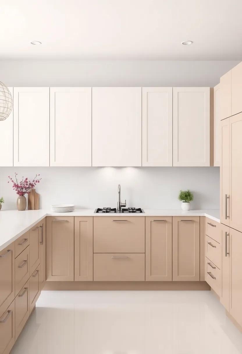
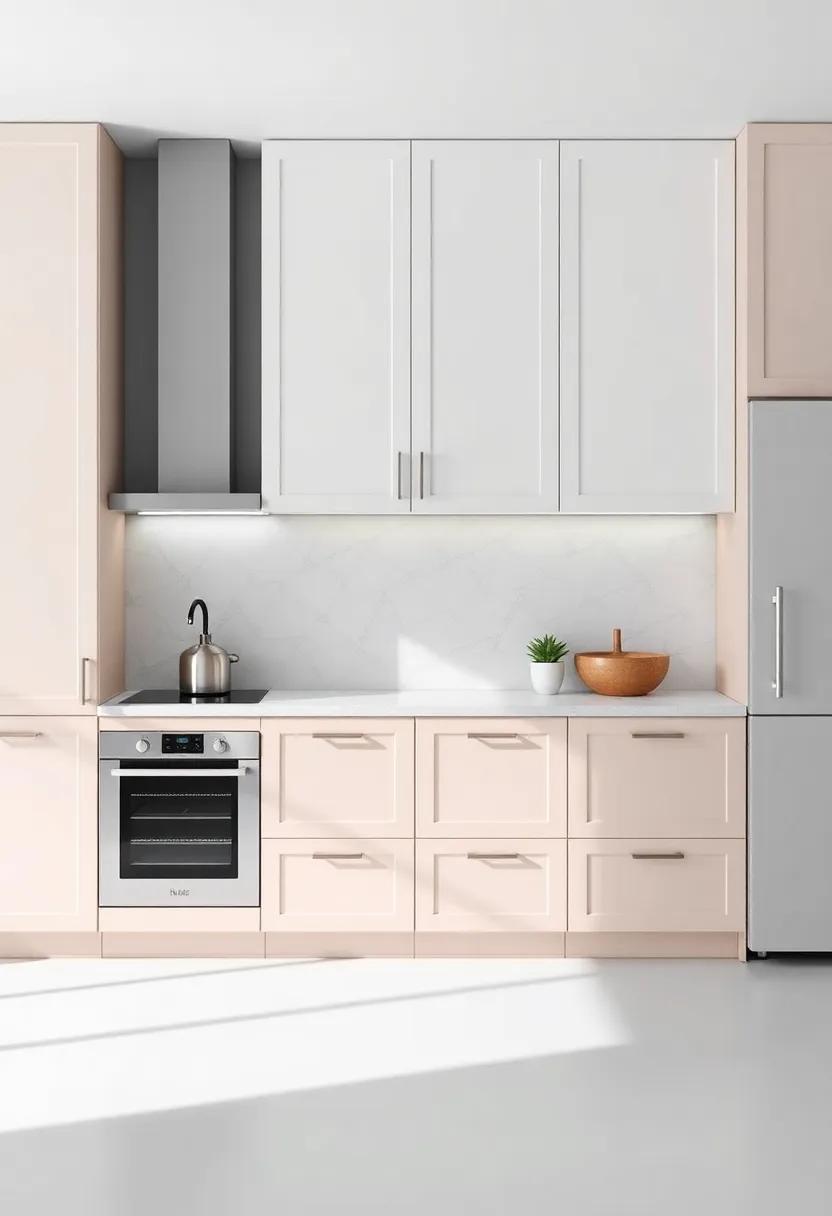
Revamping Small Kitchens: The Space-Enhancing Effect of Dual Colors
Choosing dual colors for your kitchen cabinets can create the illusion of a larger space, notably in compact areas. By opting for a lighter hue on the upper cabinets and a deeper shade on the lower, you can draw the eye upward, enhancing the sense of height and openness. This duality not only adds visual interest but also allows for the personalization of your kitchen while still maintaining a cohesive look. Consider mixing shades that complement each other, such as soft white and slate gray or sandy beige and deep navy, to create a striking yet harmonious environment.
Another effective strategy is to use one color for the cabinetry and another for the island or countertop. This tactic defines separate zones within the kitchen,adding functionality without compromising on style. When paired thoughtfully, the colors can create focal points that encourage movement and engagement in your cooking space. To maximize this effect, incorporate materials and finishes that reflect your style, such as matte finishes for a modern feel or glossy finishes to amplify light. Below is a small table that outlines some dynamic color combinations to inspire your renovation:
| Upper Cabinets Color | Lower Cabinets Color | Feeling Created |
|---|---|---|
| Soft White | Charcoal Gray | Modern Elegance |
| Pale Blue | Rich Navy | Calm & Classic |
| Light Sage Green | Deep Forest Green | Fresh & Inviting |
| Sunny Yellow | Warm Wood | Cheerful & Cozy |
Timeless vs. Trendy: Finding Your Style in Two-Toned cabinetry
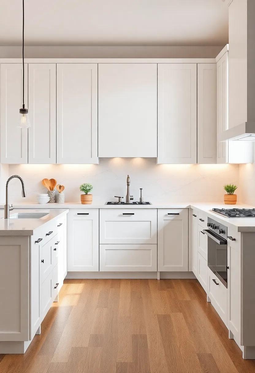
When considering the allure of two-toned cabinetry, it’s essential to find a balance between timeless charm and trendy flair. Timeless styles tend to evoke a sense of elegance that transcends seasons, ensuring your kitchen remains inviting and classic over the years. Elements such as soft whites paired with deep woods or muted greys contrasted with natural finishes can create a cohesive look that stands the test of time. On the other hand, trendy colors and patterns—like bold blues or playful pastels—can introduce a fresh vibrancy to your space. These trends, while captivating today, may require more frequent updates to keep your kitchen feeling current.
To achieve the perfect mix, consider using the following approaches:
- Balance: Match a bold lower cabinet color with soft upper cabinetry for contrast.
- Material mix: Combine painted wood with natural finishes for a rich texture.
- Accent lighting:** Highlight different tones with strategically placed lights.
Experimenting with two-toned designs can also be visualized in a simple table:
| Style | Description |
|---|---|
| Classic Pairing | Soft white on top, rich walnut below |
| Modern Contrast | Slate grey upper cabinets with bright teal bases |
| Warm & Cozy | Light oak paired with deep navy |
Combining these elements ensures that your chosen style reflects not only aesthetic appeal but also your unique personality, creating a kitchen that feels both fresh and enduring.
Inspiration from Nature: Earthy Color Palettes for Your Kitchen
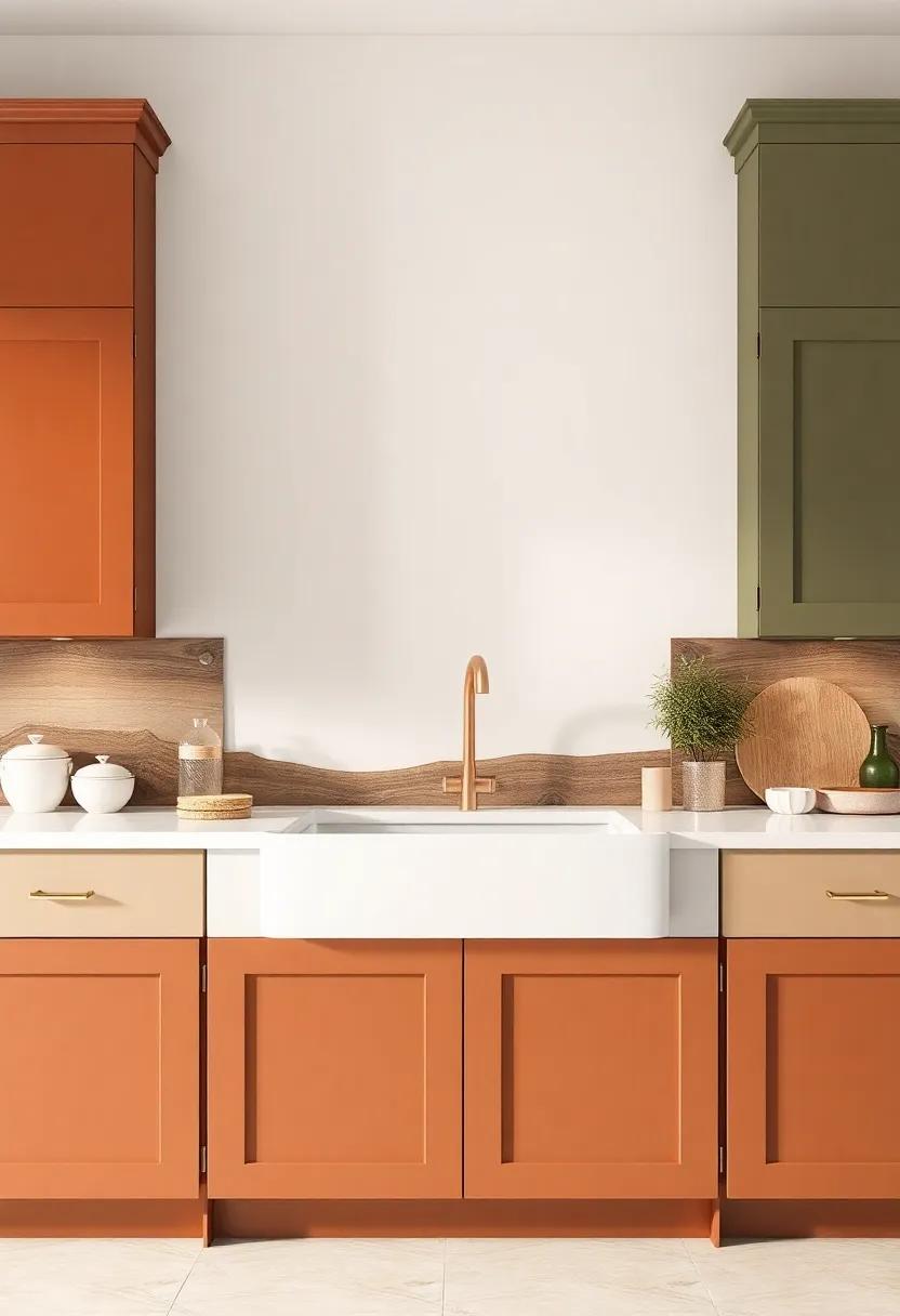
Drawing inspiration from the natural world can transform your kitchen into a serene oasis. utilizing earthy color palettes, you can create a harmonious environment that evokes a sense of calm and tranquility. Imagine cabinets adorned in rich hues of forest green and warm taupe, reminiscent of a lush woodland.Combine these colors with natural wood textures and stone surfaces to enhance the organic feel. Consider these popular earthy combinations for your two-toned cabinets:
- Terracotta & Cream – Echoing the warm tones of the earth.
- Olive Green & Soft Beige – A nod to the vibrant greenery of nature.
- Slate Grey & Crisp White – Reflecting the subtle elegance of rocky landscapes.
- Rich Brown & Tranquil Blue – A palette capturing the essence of serene lakes.
To complement these stunning color schemes, consider the use of natural materials that harmonize with your chosen palette. Adding elements such as reclaimed wood shelves, stone countertops, or metallic finishes can create a layered look that feels both contemporary and timeless. Below is a quick reference to help you visualize how these earthy tones can be paired with popular kitchen materials:
| Color Combination | Material Pairing |
|---|---|
| Terracotta & Cream | Textured Wood & Marble |
| Olive Green & Soft Beige | cork & Polished Concrete |
| Slate Grey & Crisp White | Stainless Steel & Glass |
| Rich Brown & Tranquil Blue | Slate Tiles & Natural Fiber |
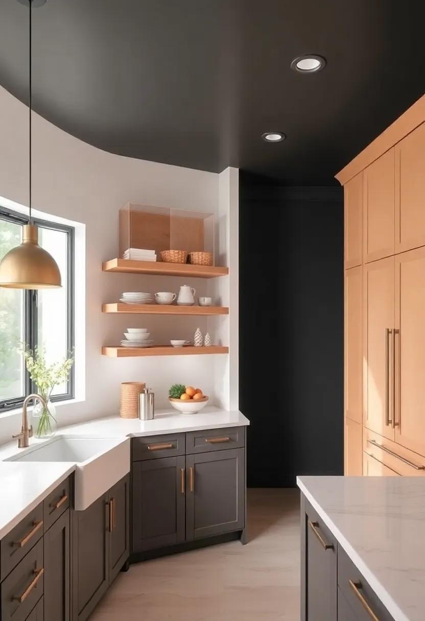
Highlighting Architectural Features with Two Contrasting Cabinet Shades
One of the most striking aspects of two-toned kitchen cabinets is their ability to highlight and enhance architectural features within a space. By choosing contrasting shades, homeowners can draw attention to specific elements such as moldings, windows, and ceilings, creating a dynamic interplay of shapes and colors. Dark cabinets can offer a dramatic contrast to lighter hues,making architectural details stand out. Additionally, the juxtaposition of colors can create a visual rhythm that guides the eye throughout the room, leading to a more cohesive and engaging environment.
When selecting shades for your cabinetry, consider the following tips to elevate your kitchen’s architectural features:
- Accentuation: Use a darker shade for the island or lower cabinets to ground the space.
- Light Reflection: Lighter upper cabinets can encourage natural light to bounce around, enhancing the room’s airy feel.
- Pair with Materials: Choose colors that complement or contrast with countertops and backsplashes for a harmonious look.
To provide a clear visual of how contrasting shades work to accentuate architectural elements, consider this selection of popular color combinations:
| Base Color | Contrast Color |
|---|---|
| Soft White | Slate Gray |
| Light Sage | Charcoal Black |
| Honey Oak | Marine Blue |
Experimenting with Texture: Matte vs. Glossy Finishes in Cabinetry
When designing a kitchen, the choice between matte and glossy finishes for cabinetry can significantly influence the overall aesthetic and functionality of the space. Matte finishes offer a sophisticated, understated elegance, exuding a warm, inviting atmosphere that feels perfectly in sync with modern design trends. These surfaces have the ability to disguise fingerprints and smudges, ensuring that the cabinets maintain their pristine appearance with minimal upkeep.In contrast, glossy finishes bring a vibrant, reflective quality that can enhance the natural light within the kitchen, making the space feel larger and more dynamic. The high sheen speaks volumes about contemporary style, even lending an air of luxury to simpler designs.
Choosing between these finishes also involves considering how thay complement contrasting colors in two-toned cabinetry. for instance, a rich navy blue in a matte finish paired with a crisp white glossy upper cabinet creates a captivating depth and harmony. Similarly, an emerald green matte base with a golden oak glossy top can become a statement piece in itself, adding character to your kitchen decor. Here’s a quick comparison of the two finishes:
| Finish Type | Key Characteristics |
|---|---|
| Matte | – Subtle elegance – Hides fingerprints - Softer to the touch |
| Glossy | – Reflective surface – Brightens space – Requires more maintenance |
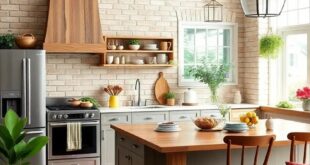
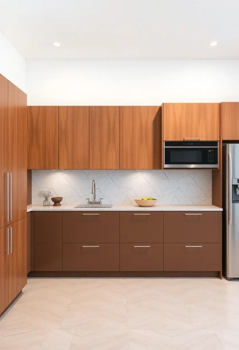
From Rustic Charm to Sleek Modernity: Versatile Two-Toned Choices
two-toned kitchen cabinets offer an exquisite blend of rustic charm and sleek modernity, catering to diverse design preferences. By combining contrasting colors, homeowners can create a dynamic visual experience that allows for personal expression, making kitchens feel both inviting and contemporary. Some popular color pairings include:
- Classic White and Deep Navy: A timeless duo that exudes sophistication.
- Light Gray and Charcoal: Perfect for a monochromatic yet warm feel.
- Soft Sage and Cream: Ideal for a fresh, nature-inspired vibe.
- Bold Black and Warm Wood: A dramatic contrast that adds depth and texture.
This innovative approach not only enhances the kitchen’s aesthetic appeal but also defines its layout. With carefully selected tones, homeowners can emphasize certain areas, such as kitchen islands or upper and lower cabinets, creating a focal point that draws the eye. Consider using color combinations to achieve distinct moods, and remember that the right finish can further elevate the overall design. Check out the table below for inspiration on how different hues can transform the atmosphere of your kitchen:
| Color Combination | Mood Created | Best For |
|---|---|---|
| White & navy | Elegant & Timeless | Classic Designs |
| Light Gray & Charcoal | Modern & Sleek | Contemporary Spaces |
| Sage & Cream | Fresh & Inviting | Traditional Homes |
| black & Wood | Dramatic & Bold | Industrial Flair |
Lighting Considerations to Enhance Your Two-toned Kitchen Aesthetic
To truly enhance the aesthetic of a two-toned kitchen, lighting plays a pivotal role. Consider layering your light sources to create depth and highlight the contrasting colors.Use pendant lights over key areas, such as the island or dining space, to draw attention to the beautiful cabinetry. For an added touch of drama, opt for fixtures in materials that reflect your chosen tones, such as bronze or brushed nickel. integrating under-cabinet lighting can also illuminate your countertops, making the colors pop and providing functional lighting for meal prep.
When planning your lighting scheme, think about incorporating a variety of fixtures to complement the dual tones of your cabinets. Here are a few suggestions for effective lighting design:
- Task Lighting: install focused lighting above work areas to ensure visibility and enhance functionality.
- Accent Lighting: Use spotlights or picture lights to draw attention to decorative elements and create visual interest.
- Ambient lighting: Soft, diffused light from flush mounts or chandeliers can warm up the space and create a welcoming atmosphere.
to illustrate how these lighting options can complement your two-toned design,consider the following table for a visual reference:
| Lighting Type | Effect on two-Toned Cabinets |
|---|---|
| Pendant Lights | Highlight the contrast between the two tones while offering focused illumination. |
| Under-Cabinet Lighting | Creates a glow that accentuates color differences and enhances the workspace. |
| Recessed Lighting | Offers a minimalist look, keeping the focus on the cabinetry colors without distraction. |
Curating Accessories that Elevate Two-Toned Cabinet Designs
When it comes to two-toned cabinet designs, the right accessories can truly amplify their beauty and personality. Consider adding hardware that contrasts, yet complements your palette; think brushed brass knobs paired with deep navy cabinets or sleek black pulls on soft grey finishes. These small touches can add dimension and draw the eye,making your cabinets the focal point of the kitchen. Additionally, incorporating open shelving can enhance this aesthetic, providing a space to display carefully curated dishes or decorative items that resonate with your chosen color scheme.
Lighting plays a crucial role in showcasing the unique characteristics of two-toned cabinetry. Integrate pendant lights that hang above islands or counters, selecting fixtures that harmonize with the hues of your cabinets. Soft, warm lighting can accentuate the textures and contrasts, creating an inviting atmosphere. Additionally, the use of natural materials in decor, such as wooden trays or stone-based accent pieces, can reinforce the theme of sophistication while maintaining a cohesive look. To inspire your accessorizing journey, here’s a quick reference table of ideal accompaniments:
| Cabinet Color | Suggested Hardware | Complementary Accessories |
|---|---|---|
| White & Navy | Brushed Brass | Wooden Serving Boards |
| Grey & Charcoal | Sleek Black | Textured Ceramics |
| Soft Taupe & Forest Green | Antique Bronze | Woven Baskets |
Flooring Selections that Harmonize with Two-Toned Kitchen Styles
When it comes to choosing flooring that complements the striking aesthetic of two-toned kitchens, consider materials that seamlessly integrate with the duality of your cabinetry. Natural wood floors bring a warm, organic element, enhancing the richness of dark cabinetry while harmonizing beautifully with lighter tones.Alternatively, polished concrete offers a modern edge, providing a sleek contrast that speaks to contemporary design, or luxury vinyl planks can mimic hardwood with added durability and water resistance, making them perfect for high-traffic kitchen areas.
Color plays a pivotal role in linking your flooring with a two-toned kitchen. here are some effective choices:
- Warm-toned woods: Maple or oak floors that lean toward honey or caramel shades.
- Cool-toned tiles: Gray or slate tiles that resonate with cooler cabinet colors.
- Neutral laminate: Subtle beige or taupe that can ground any kitchen palette.
- Bold patterns: Geometric tiles in black and white for a striking juxtaposition.
To visualize the harmony, consider the table below that matches cabinetry styles with flooring trends:
| Cabinet Style | Recommended Flooring |
|---|---|
| Dark Upper, Light Lower | Natural oak Flooring |
| Light Upper, Dark Lower | Polished Concrete |
| Muted Pastels | Subtle Beige Laminate |
| Bold Contrasts | Black and White Geometric Tiles |
Seasonal Refresh: Using Two-Toned Cabinets for a Year-Round Look
Embracing two-toned cabinets in your kitchen not only enhances the aesthetic appeal but also provides a versatile solution to adapt to seasonal changes. By combining rich,dark tones with lighter,airy colors,you create a dynamic space that feels fresh and inviting throughout the year. Here are some suggestions to keep your kitchen seasonal-ready:
- Fall Vibes: Pair deep forest greens with warm whites to embrace the autumn aesthetic.
- Winter warmth: Incorporate sleek navy blue with bright white for a cozy, chic winter feel.
- Spring Freshness: Blend soft pastel hues with natural wood finishes to welcome spring blooms.
- Summer Brights: Use vibrant yellows or turquoise with crisp white for a refreshing summer look.
Furthermore,mixing cabinet colors allows you to play with textures and materials,enhancing the overall visual contrast in your kitchen.Consider integrating open shelving with cabinetry for added depth, showcasing seasonal decor or dishware.Here’s a quick look at popular two-tone combinations that align beautifully with each season:
| Season | Color Combination |
|---|---|
| Fall | Dark Green & Cream |
| Winter | navy Blue & White |
| Spring | Pastel Pink & Light Wood |
| Summer | Turquoise & Bright White |
Transforming Your Kitchen’s Mood with a Splash of Color and Contrast
One of the most powerful ways to breathe new life into your kitchen is by incorporating vibrant colors and bold contrasts with two-toned cabinets. This dynamic approach allows homeowners to select a primary hue that defines their style while introducing a complementary secondary tone to create a visually striking focal point. Whether you prefer a soothing palette of soft blues and whites or a bolder combination like deep navy and rich mustard, the possibilities are endless. Playful contrasts in cabinet colors can help to highlight architectural features, seamlessly blending form and function.
Consider these essential tips when choosing colors to transform your kitchen:
- Balance is Key: Ensure that one color dominates while the other serves as an accent.
- Material Matters: Different finishes can enhance the colors; think gloss for modern or matte for rustic.
- Natural Light: Observe how colors interact with light throughout the day to make informed decisions.
| Color Pairing | Vibe |
|---|---|
| White & Navy | Classic Elegance |
| Mint & Charcoal | Fresh & Modern |
| mustard & Soft Grey | Warm & Inviting |
| Coral & Cream | Bright & Cheerful |
A Journey Through Time: The Evolution of Two-Toned Kitchen Trends
Over the decades, the kitchen has transformed from a purely functional area to a central hub of home life, and the color palette has played a pivotal role in this evolution. In the early 20th century, kitchens were frequently enough dominated by white or pastel hues,reflecting a sense of cleanliness and simplicity. as the years progressed, particularly during the 1980s and 90s, bold colors began to make their way in, giving rise to the use of two-toned cabinetry that introduced both contrast and depth. Homeowners started to embrace the idea of mixing colors, with darker bottom cabinets paired with lighter upper ones, which not only created visual interest but also introduced an unexpected layer of sophistication to what was once a straightforward design choice.
In contemporary design, the appeal of two-toned kitchen cabinets has only grown, driven by a desire for personalization and customization. Currently popular pairings include deep navy blues with crisp whites or earthy greens with warm woods.These combinations allow homeowners to make a statement while maintaining balance in the overall aesthetic of the space. The flexibility in color combinations also means that each kitchen can reflect the personality of its owners, whether they prefer a sleek, modern look or a cozy, rustic feel. Here are a few trending color pairings:
| Upper Cabinets | lower Cabinets |
|---|---|
| Soft Gray | Charcoal black |
| Ivory | Rich Espresso |
| Seafoam Green | Deep Navy |
| Pale Blue | Warm Oak |
Wrapping Up
As we draw the curtains on our exploration of two-toned kitchen cabinets, it becomes clear that this design choice transcends mere aesthetics—it’s about crafting an environment that resonates with your personal style while enhancing functionality. The allure of contrasting colors brings depth and dynamism to what is often the heart of the home, inviting creativity and conversation in equal measure. Whether you lean towards bold hues or subtle variations, the magic lies in the thoughtful pairing of shades that reflect your individuality.
As you embark on your own kitchen transformation journey, remember that the beauty of two-toned cabinets lies not just in their visual appeal but in their ability to evoke joy and inspiration in everyday spaces. Embrace the potential of this innovative trend, and let your kitchen tell a story that is distinctly yours—one brushstroke at a time. With each choice you make, you’re not just designing a space; you’re crafting a sanctuary that invites warmth and connection. Happy decorating!